Giving an iconic grape drink a bolder voice
Vinea is an iconic sparkling grape drink with strong recognition and emotional value. We refreshed its packaging and visual world around real grapes, natural imperfection and a bolder, more expressive brand voice.
Type
Services & Industry

A love brand with raw grape energy
Vinea already had strong recognition and emotional value, but its visual identity needed a fresher and more expressive direction. The redesign focused on what makes the drink unique: real grapes, natural taste, and a brand personality that feels bold, honest, and alive.
Instead of creating a polished and perfect fruit image, the new concept celebrates grapes as they really are - raw, lush, imperfect, and full of energy. This gave Vinea a more authentic visual world and helped the brand feel more natural, emotional, and memorable.


Packaging design with natural imperfection
The complete product portfolio was redesigned around the idea of grapes growing freely through the brand itself. Retouched cliché fruit visuals were replaced with a more organic and powerful expression, where grapes feel wild, fresh, and full of life.
The packaging keeps Vinea’s iconic logo at the center, but lets the grape imagery interact with it in a more dynamic way. The result is a distinctive shelf presence that feels familiar, yet more modern, expressive, and full of natural character.


Key visuals full of life
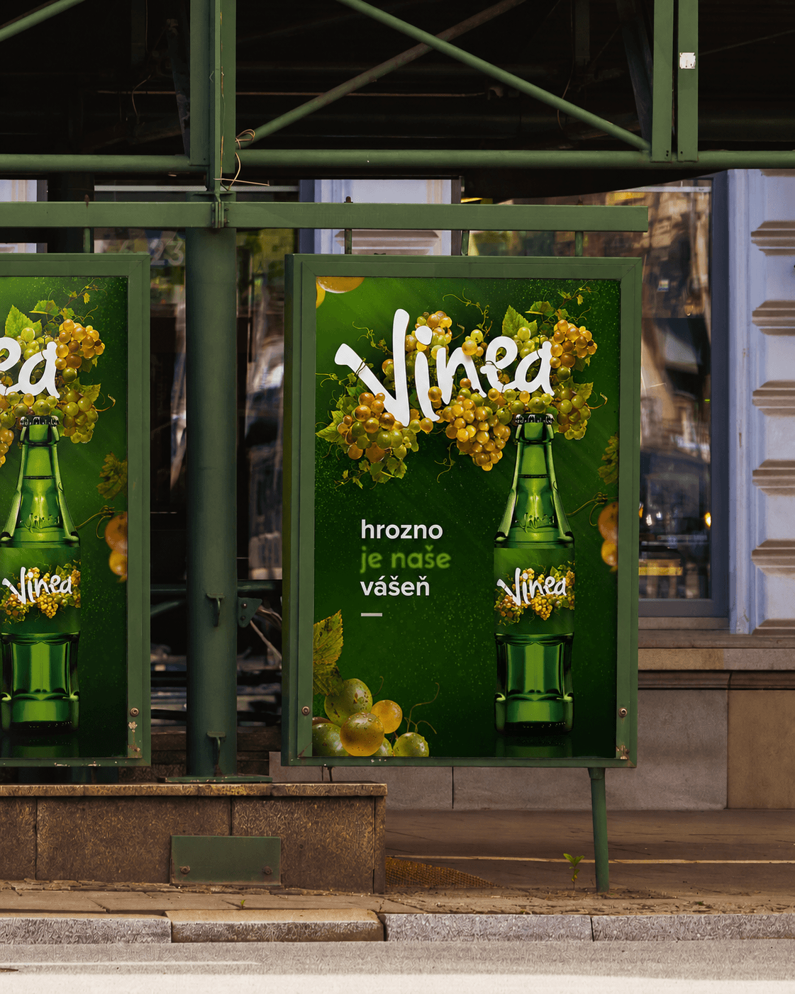
The key visuals extend the same raw grape energy beyond packaging. Grapes, leaves, textures, and bold product shots create a world that feels fresh, juicy, and naturally imperfect.
Instead of overly polished drink advertising, the visuals bring a more honest and emotional tone. They support Vinea’s passionate voice and make the brand feel vibrant, expressive, and easy to recognize across campaigns and communication.