Modernizing an artisan bakery brand
Tomšejovi is a South Moravian family bakery built on inherited recipes, honest pastry and slow-fermented bread. We modernized its positioning, visual and verbal identity and packaging for wider growth while preserving the warmth and craft behind the name.
Type
Services & Industry

How a modern visual identity helped an artisan bakery rise
Tomšejovi is more than a bakery - it’s a family legacy from South Moravia, shaped by the founder’s grandmother and her time-honored recipes. Her care lives on in every honest pastry and slow-fermented loaf.
As Tomšejovi looks to bring these beloved flavors to new tables across the country and beyond, the challenge was clear: How can Tomšejovi grow and modernize, yet always keep the soul and warmth that define it?


Objectives
Rebrand Tomšejovi into a modern artisan bakery with franchise appeal
Retain the warmth and authenticity of the brand’s family origins
Build a flexible identity system, ready for any format from small counters to full cafés
Refresh the wordmark and logo for clarity, scalability, and strong digital performance
Define a visual language that blends heritage, taste, and contemporary style
Prepare a foundation for future packaging, merchandising, and digital content


Brand positioning: baking more than bread
Before redesigning anything, we looked deeper into what made Tomšejovi meaningful - not only for loyal local customers, but for anyone who loves honest baking. Through research, competitor mapping, and real stories from families and fans, we found that Tomšejovi was not just another bakery. Its strength was the feeling behind it: warmth, care, tradition, and the comfort of something made properly.
The new positioning turned Tomšejovi into a modern ambassador of Moravian craft. It keeps the feeling of grandma’s kitchen, but adds a fresh and playful energy that can work in new towns, cafés, and future formats. The brand is not only about bread and pastries - it is about connecting generations through taste, joy, and a little piece of South Moravia.


Step 1: A new chapter for a trusted name
Tradition, regional recipes, Moravian and Slovácko roots
Handcrafted, local ingredients, authentic flavor
Innovation, aesthetics, merging tradition with the present
Family atmosphere, direct communication, community


Step 2: Defining the visual soul of Tomšejovi’s
A heritage logo, reimagined for what’s next
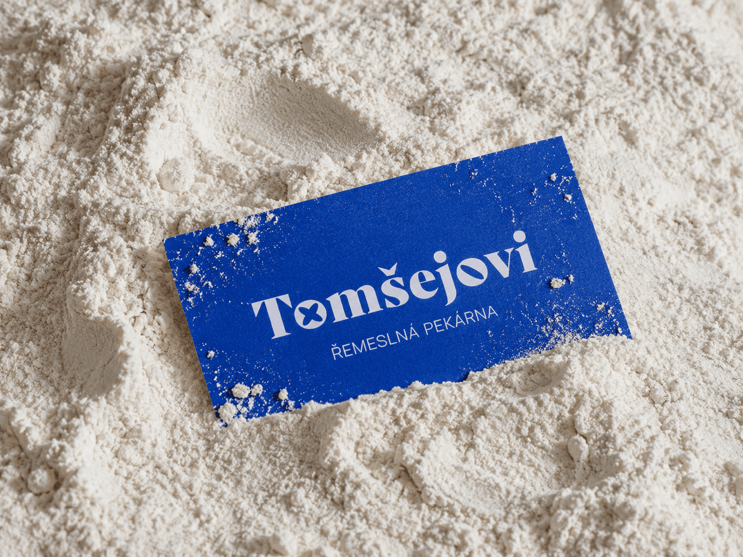
The Tomšejovi wordmark was carefully refined to balance legacy with modernity. Drawing from its original Slovácko-inspired form, the updated logo preserves its local character while gaining clarity, elegance, and flexibility across all brand touchpoints - from storefronts to packaging.


Signature mark: shaped by the hero pastry
The signature form—drawn from Tomšejovi’s iconic svatební koláček (wedding pastry)—appears within the logotype and functions as a standalone symbol. Whether part of the wordmark or used on its own, this motif instantly evokes the bakery’s heritage product and serves as a memorable signifier of Tomšejovi’s craft everywhere.


Step 3: A system rooted in craft
Symbols that rise from the breadboard
We designed a library of custom shapes inspired by Tomšejovi’s breads, pies, and pastries. These elements bring the brand to life-appearing in the dynamic, animated versions of the logo as well as throughout brand patterns and graphics.
Crafted forms with cultural soul
Far from decorative, these symbols are functional brand elements. They can live across packaging, signage, and merch - creating consistency and recognition. Each one carries a piece of the bread’s geometry, baking visual identity into every detail.


Colors: Rooted tradition, modern energy
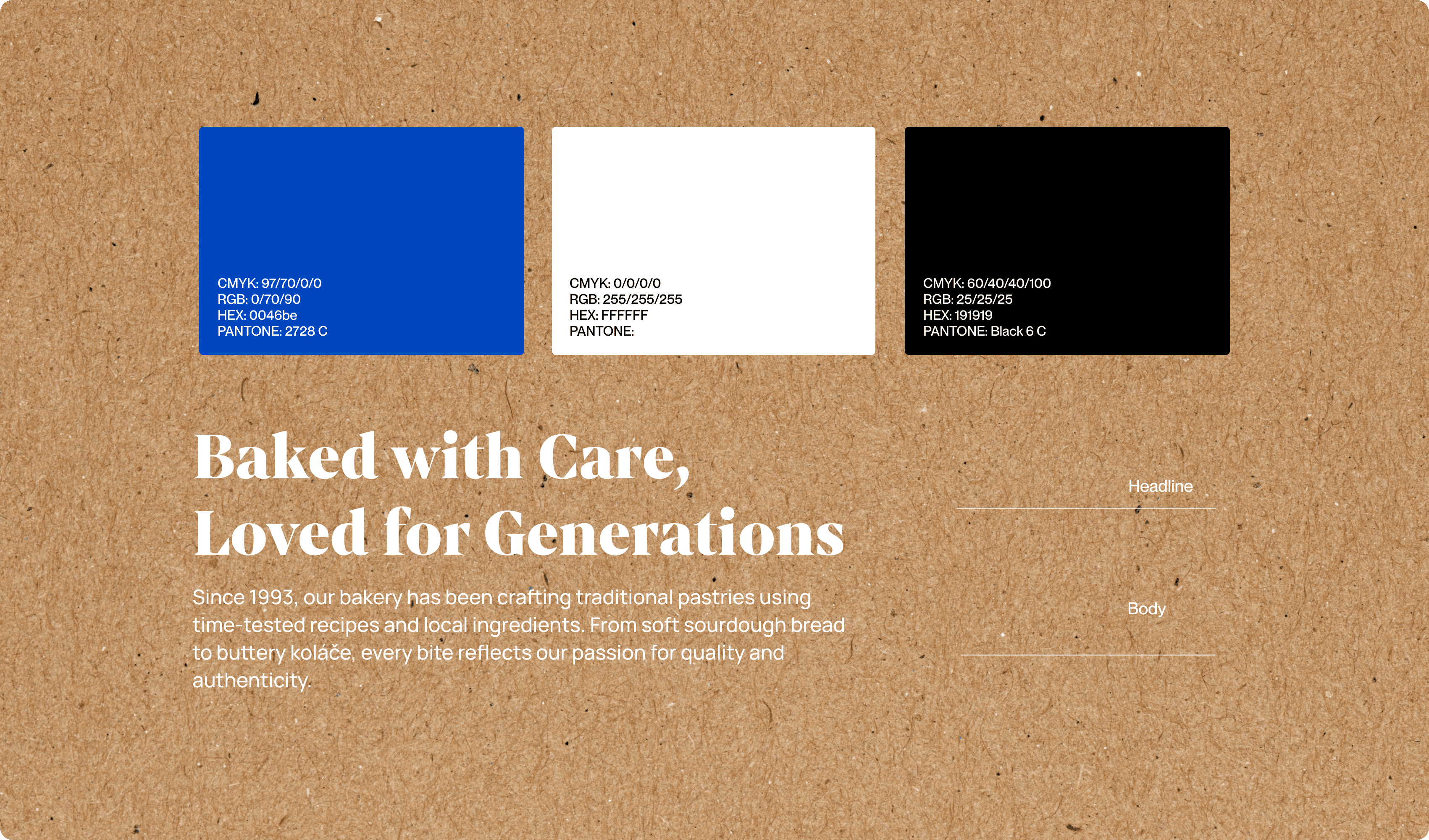
We chose a minimal palette anchored by a signature blue, inspired by Moravian wall paintings and traditional ornaments. This shade grounds the brand in local heritage, while its vibrancy adds energy and modernity, making Tomšejovi instantly recognizable in every setting.
Brand voice in type
In Moravia, people don’t take life too seriously-which inspired our signature copy style for Tomšejovi. Playful baking puns and cheeky wordplay appear across uniforms, or merch, making the brand feel warm, approachable, and full of local spirit. The result: an identity that brings a smile to everyday moments.

Modern moravian motifs with a baking twist
As part of the Tomšejovi identity, we created a contemporary take on traditional Moravian patterns-reimagined through the lens of the bakery’s craft. Each pattern features elements inspired by real pastries and breads, echoing the decorative flourishes of South Moravian village houses while grounding the brand’s visual system in both place and product.
Artisanal feel in every detail
Executed in the brand’s signature blue, the patterns are intentionally imperfect-showing rich patina, gently faded edges, and stamped-like textures reminiscent of flour on a baking board or the marks left by pastry tools. This handcrafted approach keeps every piece feeling warm, lively, and unmistakably artisan.


Results and success
✅ Greater brand recognition: The new identity makes Tomšejovi stand out in any environment, helping attract new customers and making the bakery easier to find and remember—whether on the street, online, or in social feeds.
✅ Ready for scalable growth: With a flexible system and a recognizable visual language, Tomšejovi can confidently expand into new locations and formats, knowing that the brand will stay consistent and strong across every outlet.
✅ Increased customer appeal: A warm, modern look paired with authentic storytelling turns casual shoppers into loyal regulars—encouraging return visits and greater customer engagement.
✅ Premium positioning: By building on tradition and quality, Tomšejovi can justify premium pricing and compete effectively in both local and national markets, ultimately boosting profit margins as the brand grows.
✅Solid foundation for future opportunities: The refreshed brand identity doesn’t just look good—it’s designed to support everything from new product launches to franchising and merchandising, enabling more revenue streams and long-term business growth.