Building a women's community brand
Synergiq is a community for women to exchange stories, knowledge and support across personal and professional growth. We created the name and visual identity to turn the founder's event concept into a recognizable platform.
Type
Services & Industry

From concept to community
Synergiq is a crossroads for women of all walks of life to share inspiring stories, opinions and knowledge. Synergiq’s founder, Terezia, sought a unifying brand name and visual identity to turn conceptual women’s meetings into an inspirational reality.


Objectives
Develop a brand name that encapsulates a wholesome, motivational environment
Create a brand color palette that evokes timelessness, passion, and empowerment
Design a versatile logo for digital and physical use that is professional, modern and tasteful
Target women who seek community and professional, personal growth
Stay true to Synergiq’s values while building the brand from the ground up


Designed as a space for women to inspire and grow
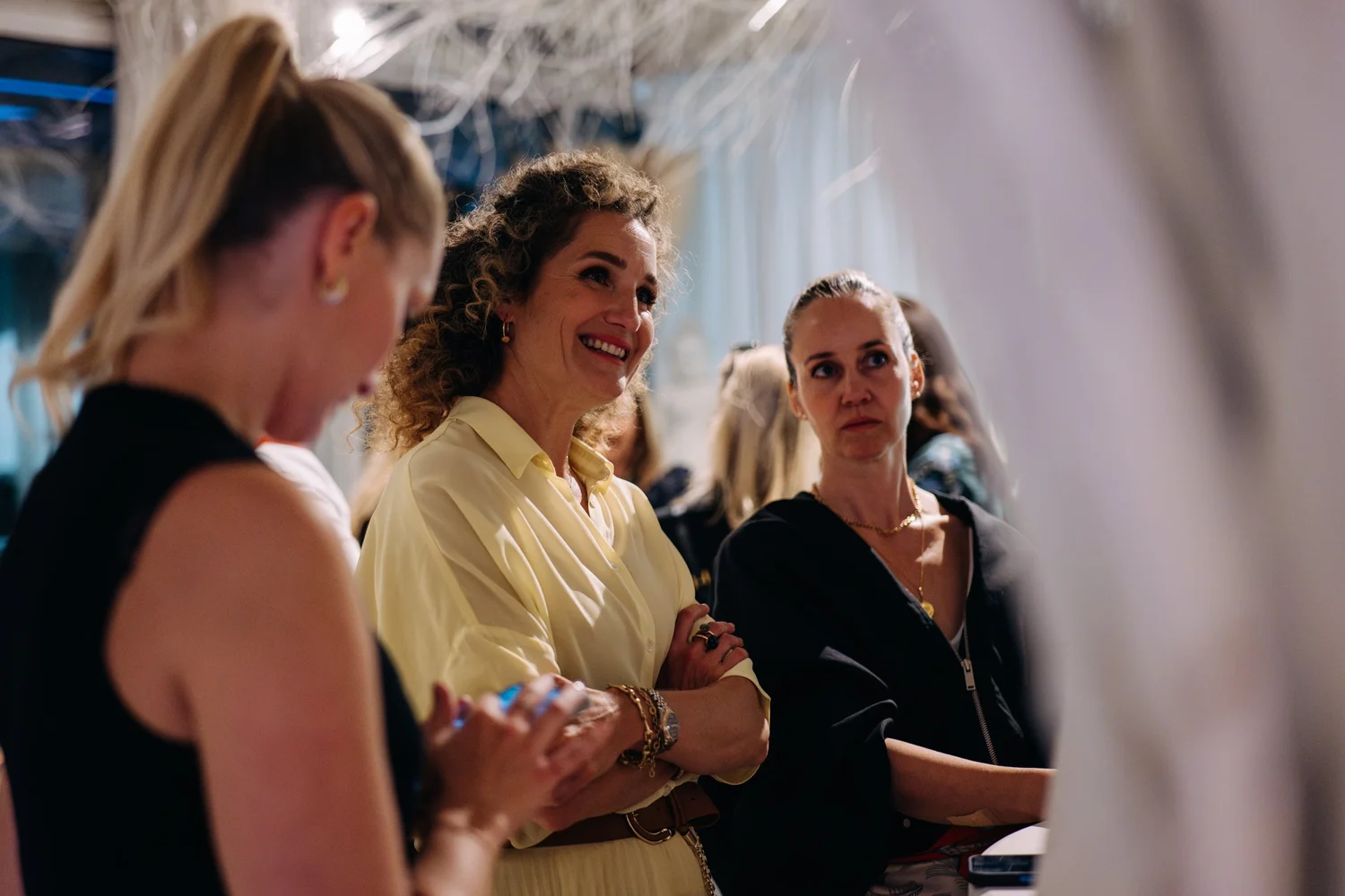
Synergiq, as a concept, is feminine and soulful, facilitating discourse between women in an empowering, inspirational environment. The meeting space supports women’s personal and professional development, combining motivational lectures with a relaxed community feel. Synergiq’s “soul-sharing” ethos comes to fruition in a space where women can form connections, build lasting relationships, and grow both independently and collectively.

Naming
Our goal was to develop a brand name that was memorable and feminine, while also alluding to the soulful connections formed during motivational or intellectual lectures. Synergiq, the finalized brand name, is a playful combination of the words synergy and chic, embodying the sophisticated, holistic energy created by a female collective, where the combined effect exceeds the sum of individual contributions.


Logo
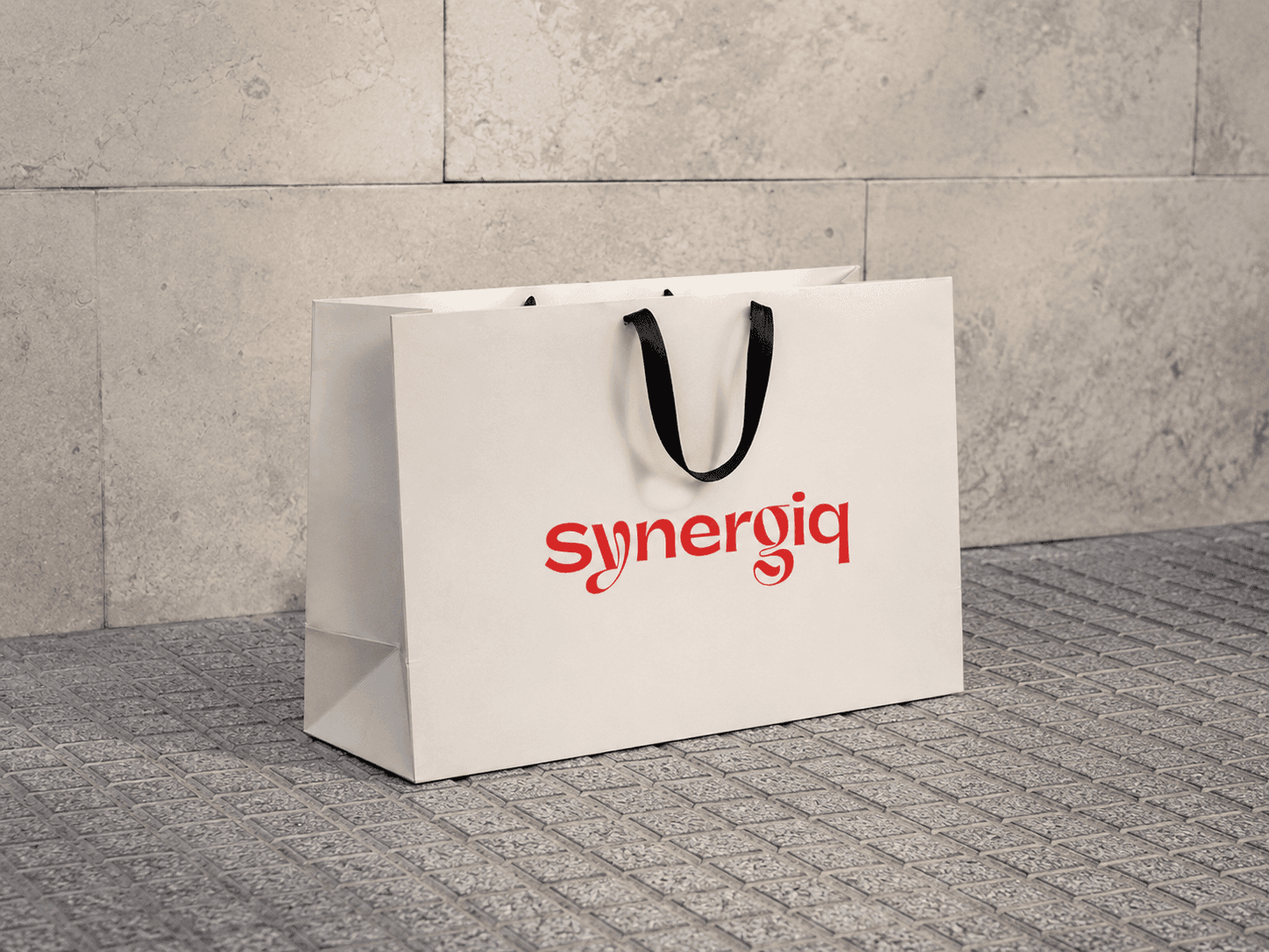
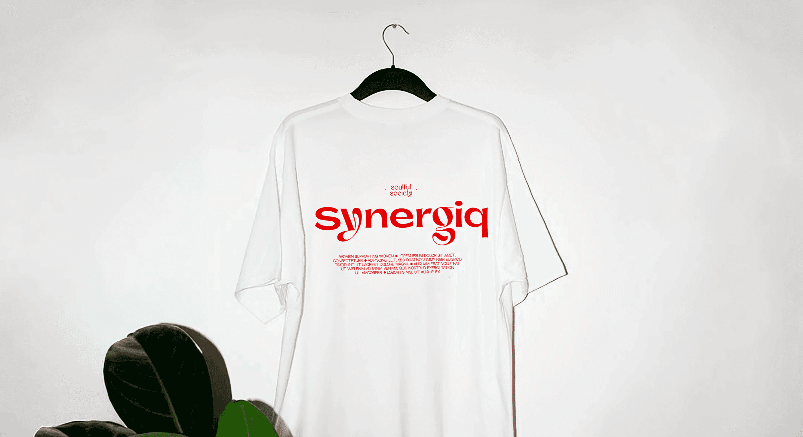
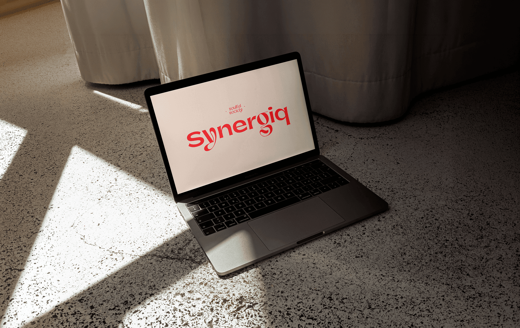
The logo was designed to reflect femininity, central to Synergiq’s core values, as well as modernity and elegance in a professional context. Paired with an abstract, circular symbol, Synergiq’s various logo iterations are manifestations of the expansion of one’s social and intellectual circles as a result of stepping outside your comfort zone.


Color palette
Synergiq’s color palette is dominated by a distinctive bright red shade, which is complemented by earthy browns and neutral shades of black and white. Red is central to Synergiq’s branding not only because the color represents passion and courage, but also because red conjures timeless feminine elegance.


Consumer insight
By creating a space that fosters connections and personal development, Synergiq is more than just a meeting place; it's a platform for women to empower each other and reach their full potential.


Impact
✅ United the brand under a fresh, meaningful brand name
✅ Created a compelling brand aesthetic with an empowering, timeless color palette
✅ Targeted women seeking an inspiring meeting place to connect with other women
✅ Integrated soul-sharing and professional elements for a comprehensive visual identity
✅ Increased brand awareness and engagement through digital strategies
✅ Helped Synergiq stay true to their core values even while developing the brand from scratch
✅ Put Synergiq on the map as a meeting space for like-minded, community-seeking women