Building the nail cosmetics brand professionals trust
Ruscona is a leading European professional nail-cosmetics brand trusted by technicians and salons. Over a decade-long partnership, we have worked alongside the team to evolve its strategy, identity and packaging in real time, expanding the system and adjusting direction as the portfolio and market changed.
Type
Services & Industry
A professional nail cosmetics brand that grew fast and needed a system to hold it.
Ruscona is one of Europe's leading professional nail cosmetics brands, trusted by nail techs and salons across the continent.
We first worked together in 2017 and shaped their first proper professional branding, built from the ground up.
Over the following years, Ruscona grew massively. An estimated 10-15x revenue growth over the decade. Product ranges expanded, new lines launched, different influences shaped each brief. And gradually, the 2017 identity couldn't hold it all together anymore.
In 2025 we joined forces once again. This time to refocus and build a brand that reflects both where Ruscona is now, and where it's going.


The Challenge
Growth had done what it usually does - created gradual fragmentation. New collections, new lines, seasonal drops. Each one making small visual decisions of its own, until the portfolio was wide but no longer felt like one brand.
But the real work wasn't cosmetic. Before redesigning anything, we needed to go back to the core - revisit what actually makes Ruscona who she is. What she stands for, and what her relationship with her audience really looks like. Define her identity from the inside out. Only then could we build a system that holds.


Step 1: Reframing the brand foundation
Because RUSCONA had already been through an earlier identity phase, we started by auditing how the brand shows up now - across the expanding portfolio, in salon reality, on e-shop listings, and in day-to-day communication. What we found matched the brand’s core challenge: as new product lines and collections were added over time, the system started to feel fragmented and harder to recognize as one brand.


Four pillars anchored everything that followed:
Trusted premium: Credible, high-quality, pro-standard.
Timeless elegance: Minimal, elegant, built to last.
Mood & variety: Flexible for every collection and vibe.
Simple, clean system: One clear framework for the full portfolio.


Step 2: Designing a system for endless newness
The identity needed to do two things at once: unify everything, and still leave room for endless collections, colours, and seasonal moods. Because nails are never just one version - and we knew going in that new products, new styles, and new drops would keep coming indefinitely.
So we built a framework that gives the brand order without rigidity. A clear structure that new collections can grow into and still feel unmistakably Ruscona - without having to fight the system or break it.


Logotype
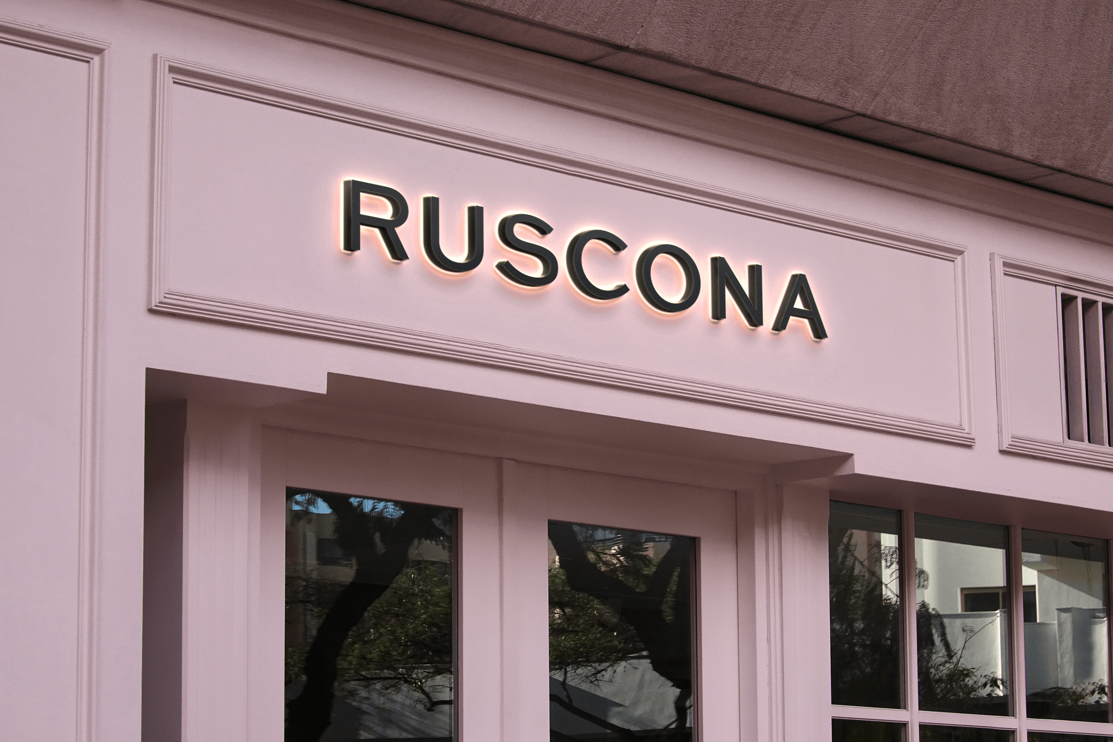
Clean, uppercase, intentionally calm. Legible at small packaging scale, premium at full size. The steady anchor in a brand that's always releasing something new.
Logo Symbol
A refined monogram built on symmetry and soft precision. Strong enough to stand alone as a seal, minimal enough to stay timeless. Designed especially for tactile applications - emboss and deboss - where restraint reads as quality.

Color Palette
Warm neutrals and soft blush tones as the base, so the core palette never fights with seasonal drops. Accent shades shift by collection; the brand stays recognisably RUSCONA.
Typography
Typography supports the same idea as the whole concept: simple, timeless, and structured. Clear hierarchy keeps product names, categories, and claims easy to scan - so the full portfolio feels consistent even when the content changes.



Pattern
Rather than adding graphics, the identity leans into tactile branding: emboss and deboss patterns derived from the symbol. Sophisticated without clutter. Minimal when needed, present when the moment calls for it.


Step 3: Making every touchpoint consistent
We translated the refreshed RUSCONA identity into real, everyday touchpoints - so it doesn’t stay a “concept,” but becomes a working system in the hands of nail techs and customers. The goal was consistency: whether you’re planning your day in the salon, opening a new tool, or browsing products online, everything feels like one calm, premium RUSCONA world.
Diary Design: We’ve been designing these planners for several years, so the system is built on a real understanding of the brand’s audience and how they actually work day to day. Created specifically with nail technicians in mind, the layout balances clear structure, clean hierarchy, and generous space for scheduling, notes, and client planning. Every detail is shaped by practical salon needs - from readability and speed of use to the flow of appointments and daily tasks. At the same time, the diary serves as a daily brand touchpoint, so it was designed to feel minimal, refined, and quietly premium in hand.


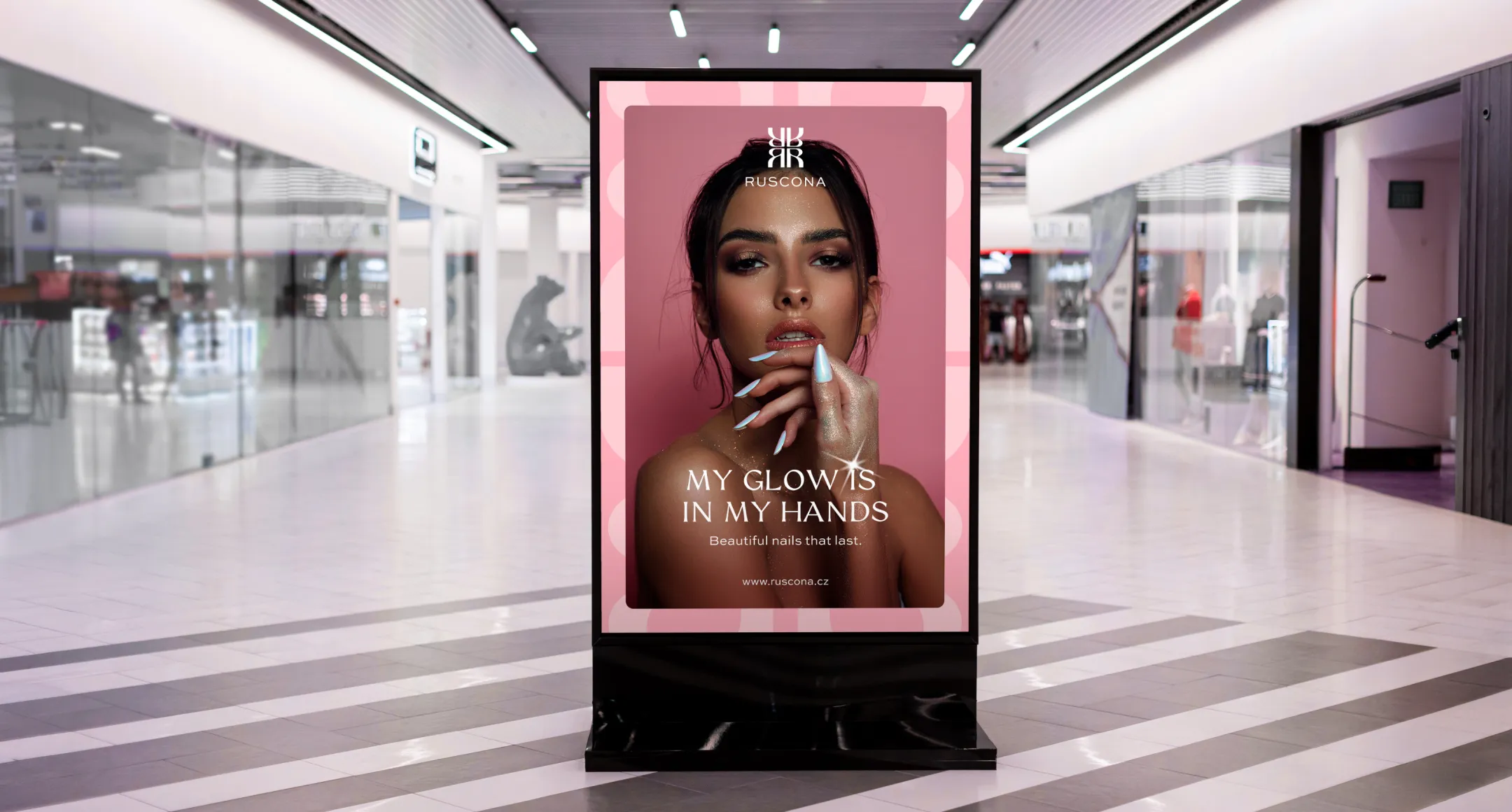
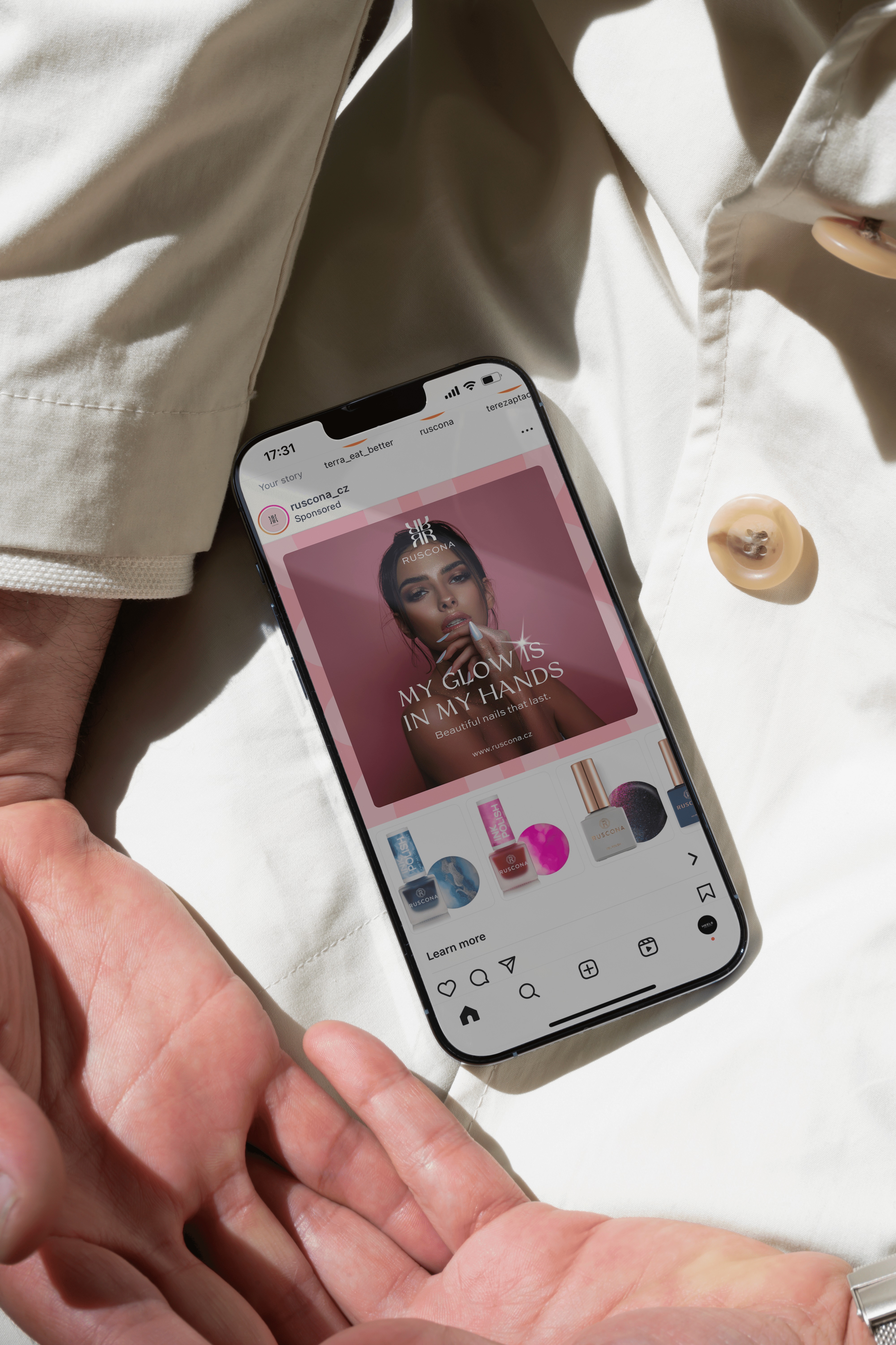
Key Visual Design: The key visual was created to express the main campaign message and give the brand a strong, recognizable visual direction. Built around the line “My glow is in my hands,” it connects beauty, confidence, and self-expression through nails. Soft light, reflective textures, and elegant product compositions help create a feminine, premium mood. The concept was designed to work across different formats, and these examples show how it translates from digital placements to outdoor campaign visuals while keeping the message consistent.
Dual Forms Packaging: For dual forms, we applied the new system through strong hierarchy and simple, modern composition - so the packaging feels clean and professional, and variants are easy to navigate. Minimal branding, clear naming, and a calm layout let the product speak while keeping everything unmistakably RUSCONA.

Nail Forms Packaging: For nail forms, we extended the same framework: consistent logo placement, structured info blocks, and a premium, minimal look that scales across variants. The result is packaging that reads fast at the nail table, looks elevated on shelf, and stays cohesive inside a larger portfolio.


Ruscona 2017-2025