A fitness community built for women who don’t quit
Queens Don't Quit is Maeve Madden's fitness brand and community for women seeking strength, confidence and connection. We created its bold identity and digital foundation to unite members across content, products and an accessible fitness app.
Type
Services & Industry

Can branding build a fitness community?
When Queens Don’t Quit, the empowering fitness brand led by the spirited Maeve Madden, came to us, they had one big goal: to create a brand design that would unite like-minded women and give them confidence-one that was as bold and vibrant as Maeve herself. They needed a look that was strong, empowering, fun, and full of life-something that could light up a room (or a screen) and get women everywhere excited to join in.
Our mission? Develop a killer logo, a playful and vibrant visual language, and those essential brand elements that would serve as the foundation for their online presence, including an intuitive, accessible fitness app that screams "Queens Do It!"


Objectives
Create a bold and distinctive identity that captures the empowering spirit of Queens Don’t Quit.
Build a playful, vibrant visual language for women seeking health, confidence, and connection.
Design fun but functional brand elements that work across the app, social media, and digital platforms.
Create an inclusive app visual style that feels user-friendly, motivating, and on-brand.
Develop a cohesive Instagram and social media system that strengthens recognition.
Bring Maeve’s energetic personality into every part of the brand.



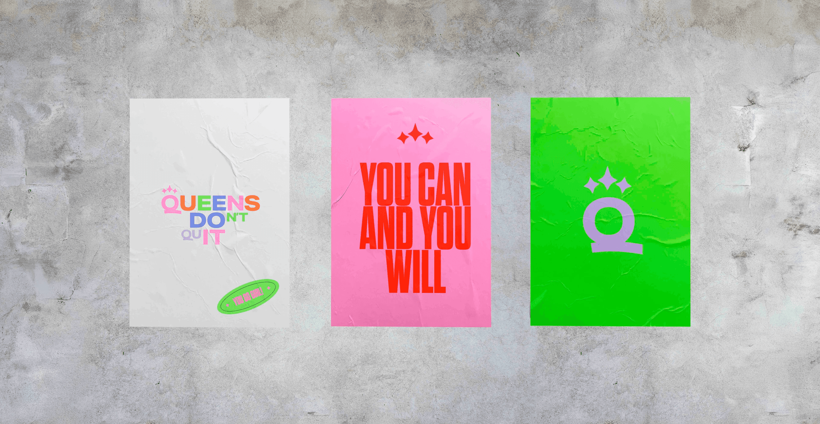

Bringing the Queens Don’t Quit Vision to Life
With the objectives clearly defined, we set out to create a brand identity that would resonate with women around the world, inspiring them to embrace their inner Queen. We knew that the branding needed to be more than just visually appealing; it had to be a rallying call for confidence, strength, and community. Here’s how we made it happen:


Logo design
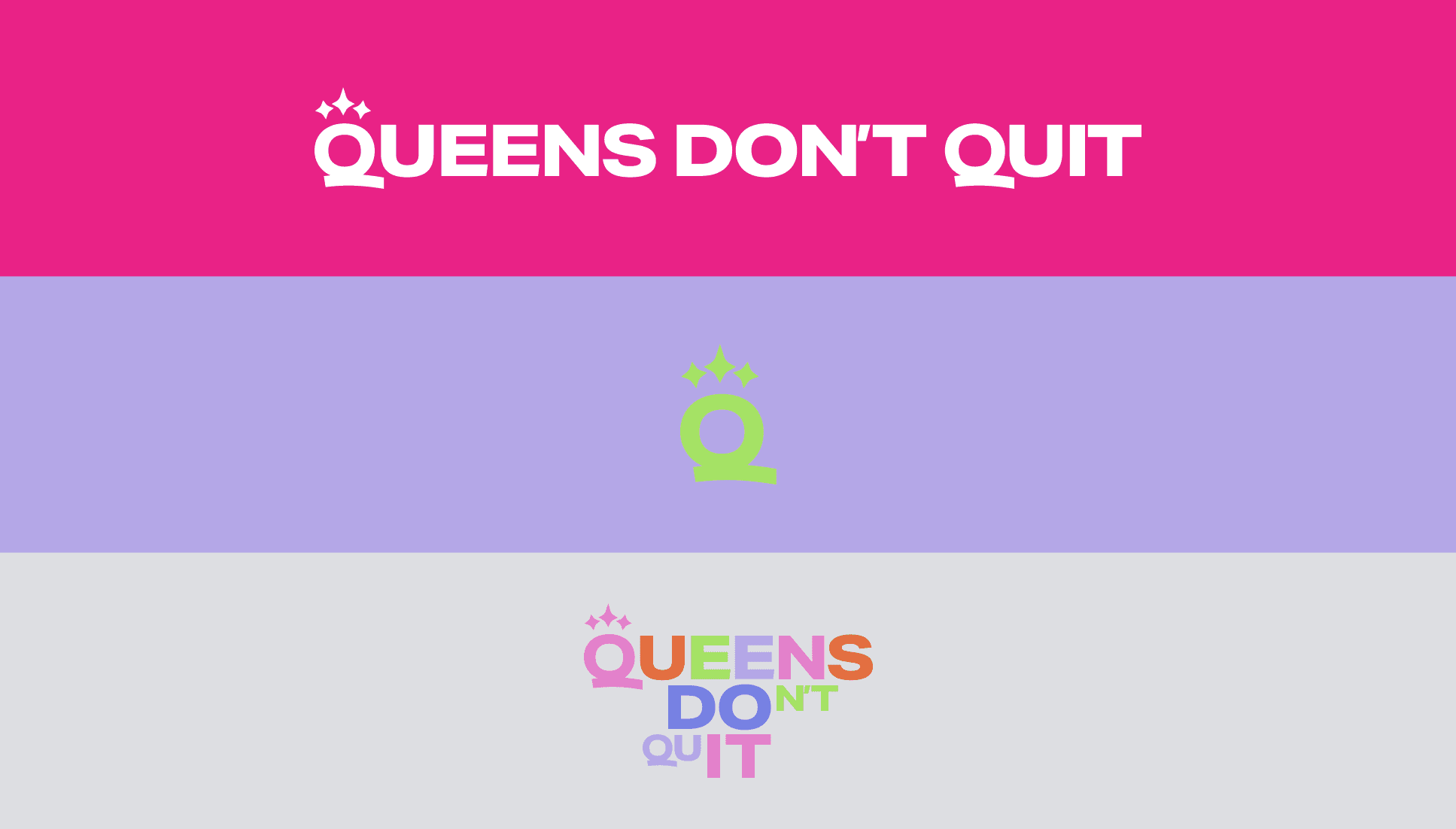
The first step in our mission was to design a logo that embodied the essence of Queens Don’t Quit. We wanted something that wasn’t just bold and vibrant, but also packed with meaning—a symbol that would instantly connect with women. The result? A dynamic logo featuring the empowering message “Queens Do It!” front and center, accompanied by a custom three-star crown. This logo wasn’t just a design; it was a statement. Whether on a t-shirt, a website, or an app icon, it’s a symbol of strength, femininity, and unshakable confidence.

Visual language
Playful, Vibrant, and Inclusive
Working out is fun! We wanted the visual identity of Queens Don’t Quit to reflect that same energy and excitement. We developed a visual language that was as lively as it was empowering. We chose a color palette bursting with energy—feminine pinks mixed with bold, vibrant hues—to create a look that’s instantly recognizable and impossible to ignore. This playful yet powerful visual identity was carefully crafted to resonate across all digital and physical touchpoints, ensuring a cohesive experience that reinforces the brand’s message of confidence and community. This visual language was also extended to the social media design, with a particular focus on creating an Instagram feed that would visually engage and inspire the brand’s audience.


Brand elements
Fun Meets Function
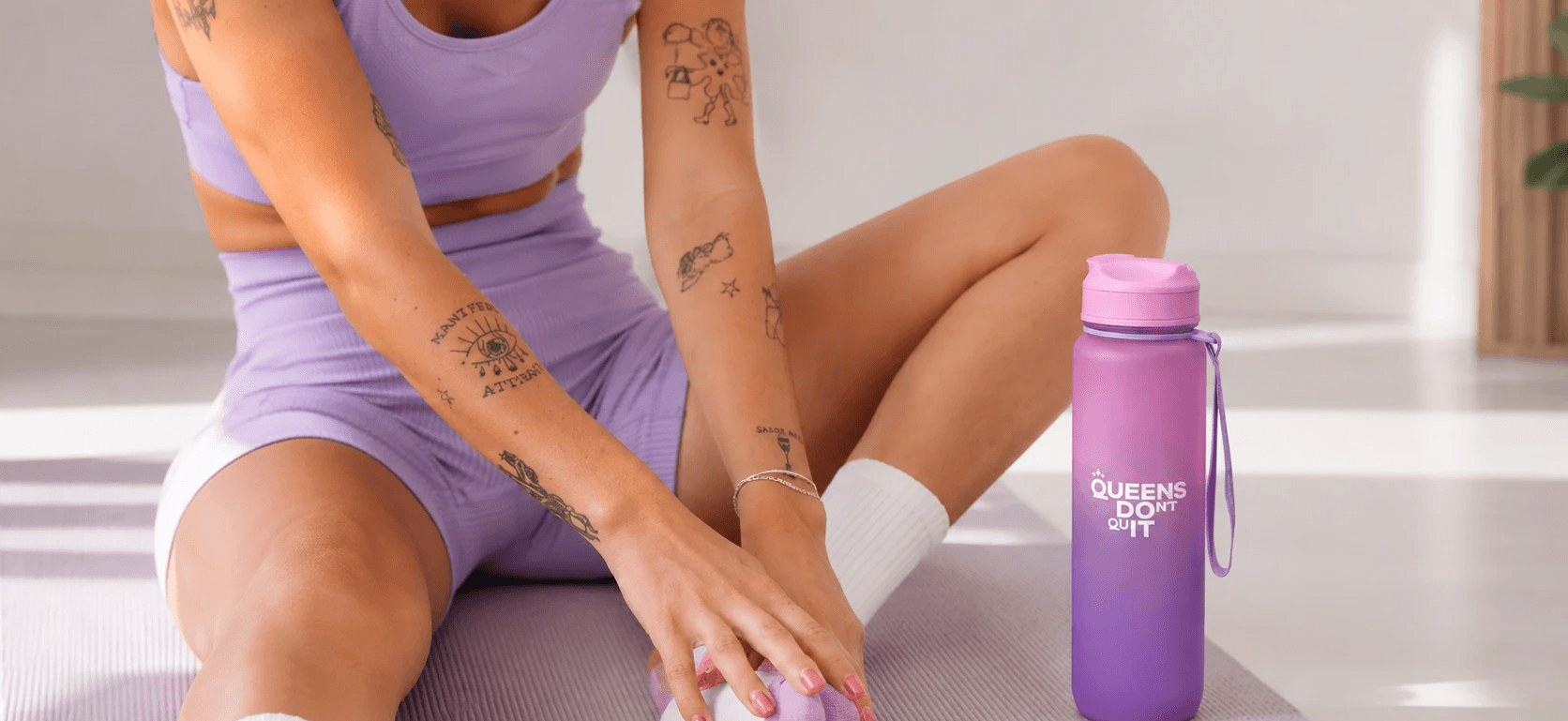
To truly bring the Queens Don’t Quit brand to life, we designed a suite of brand elements that were as fun as they were functional. These elements-ranging from bold statements to custom stickers-were tailored to work seamlessly across all platforms, especially the Queens Don’t Quit fitness app. We opted for typography that’s bold and clear, yet playful, ensuring that every piece of communication, whether on social media or in-app, was instantly engaging and accessible.


Fitness app design
User-Friendly, Inclusive, and Empowering
The Queens Don’t Quit fitness app was where all our efforts came together. We translated the bold, vibrant visual identity into an intuitive and inclusive app interface that makes every user feel like they’re part of an inspiring community. From personalized motivational messages to seamless navigation, the app was designed to be as empowering as it is engaging. Whether users were logging on for a live-streamed workout or catching up on the latest on-demand class, they were greeted with an interface that’s easy to use, visually stunning, and packed with features that inspire confidence and community.


Results
A Brand That Resonates and Unites
The outcome was a brand identity that truly captured the essence of Queens Don’t Quit. Bold, vibrant, and empowering, the brand now unites women around the globe, giving them the confidence to take on their fitness journeys together. The logo and visual language are instantly recognizable, the brand elements are both fun and functional, and the fitness app is a seamless extension of the brand’s empowering message. The cohesive social media design, especially the Instagram feed, has become a key touchpoint for engaging and inspiring the community.
This project wasn’t just about creating a brand; it was about building a movement. A movement that empowers women, celebrates confidence, and unites like-minded queens under the banner of Queens Don’t Quit. And that’s exactly what we accomplished.