Reviving a clinical skincare brand
Pyratine entered Europe with clinical proof and real results, but needed a brand presence that made its science feel premium, trustworthy, and gentle.
Type
Services & Industry

Clinical skincare meets premium packaging
When Pyratine entered the European market, the product already had everything a serious skincare brand needs: patented cytokinin technology, FDA recognition, loyal users, and visible results - from calming redness to smoothing fine lines and wrinkles.
But the visual identity told a different story. Outdated packaging, harsh graphics, and an aggressive red detail made the brand feel more alarming than trustworthy. To compete in a premium skincare market, Pyratine needed to look as credible, gentle, and science-backed as the formula actually was.


Objectives
Make Pyratine look as powerful as it performs
Design packaging that signals trust at first glance
Modernize the brand while keeping the name and signature red
Build a unified, high-end system across all product lines
Set Pyratine up to stand out on shelves - and scale globally


Step 1: Laying the brand foundation
Formula, flamey first Impression ❌
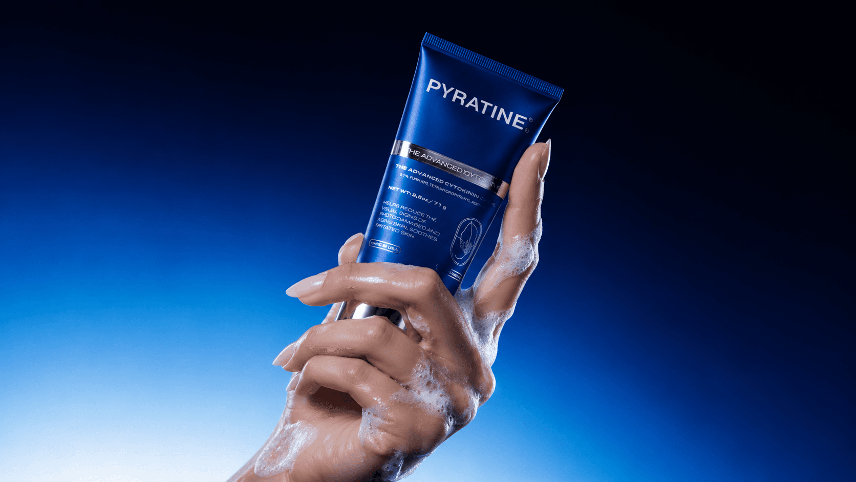
Pyratine’s old packaging didn’t say “soothes redness.” It felt more like a warning sign. The aggressive red swoosh, lack of clinical cues, and outdated design created confusion instead of trust. Our rebrand flipped the message with clean, confident packaging that builds credibility before the label is even read.
Designed to feel premium (because it is)
Pyratine’s formulas are FDA-recognized and built on patented cytokinin technology, but the brand didn’t visually reflect that credibility. We created an identity that feels science-backed, premium, and trustworthy - focused on real performance, not empty beauty claims.
Rooted in structure, built for scale
Pyratine needed more than one good-looking product. We created a cohesive system across Pyratine XR and Pyratine 6, using smart color coding, metallic accents, and consistent visual rules to build trust across the full portfolio.


Step 2: Elements the rebrand is built on
Science/beauty logo: A precise logo that balances clinical credibility with visual elegance.
Medical visual language: Inspired by pharmaceutical design-clean, minimal, and trustworthy.
Metallic details: Silver and glossy finishes evoke purity, clarity, and high-end performance.
Signature brand red: A bold, consistent red that reinforces recognition and authority.
Cytokinin symbol: A subtle metaphor rooted in the product’s scientific and botanical origin.
Portfolio consistency: A unified design system across Pyratine XR and Pyratine 6 products.


Step 3: A Visual system rooted in science
Built to be remembered
The Pyratine logotype was designed to feel precise, clean, and grounded in science-while still reflecting the sophistication expected from high-end skincare. We used an extended, geometric typeface to convey structure and stability, then refined the spacing to create a sense of calm and confidence.
Where Science Becomes Brand
The result is a visual mark that works across digital and physical formats, reinforcing Pyratine’s identity as both a dermatological solution and a premium brand.


Step 4: A system built for scalability (and shelf appeal)
Two formulas, one unified system
Each product-Pyratine 6 and Pyratine XR-carries its own distinct color story, but shares a consistent visual language. Glossy finishes, the cytokinin symbol, and red or blue accents bring cohesion across the line while giving each formula its own identity.
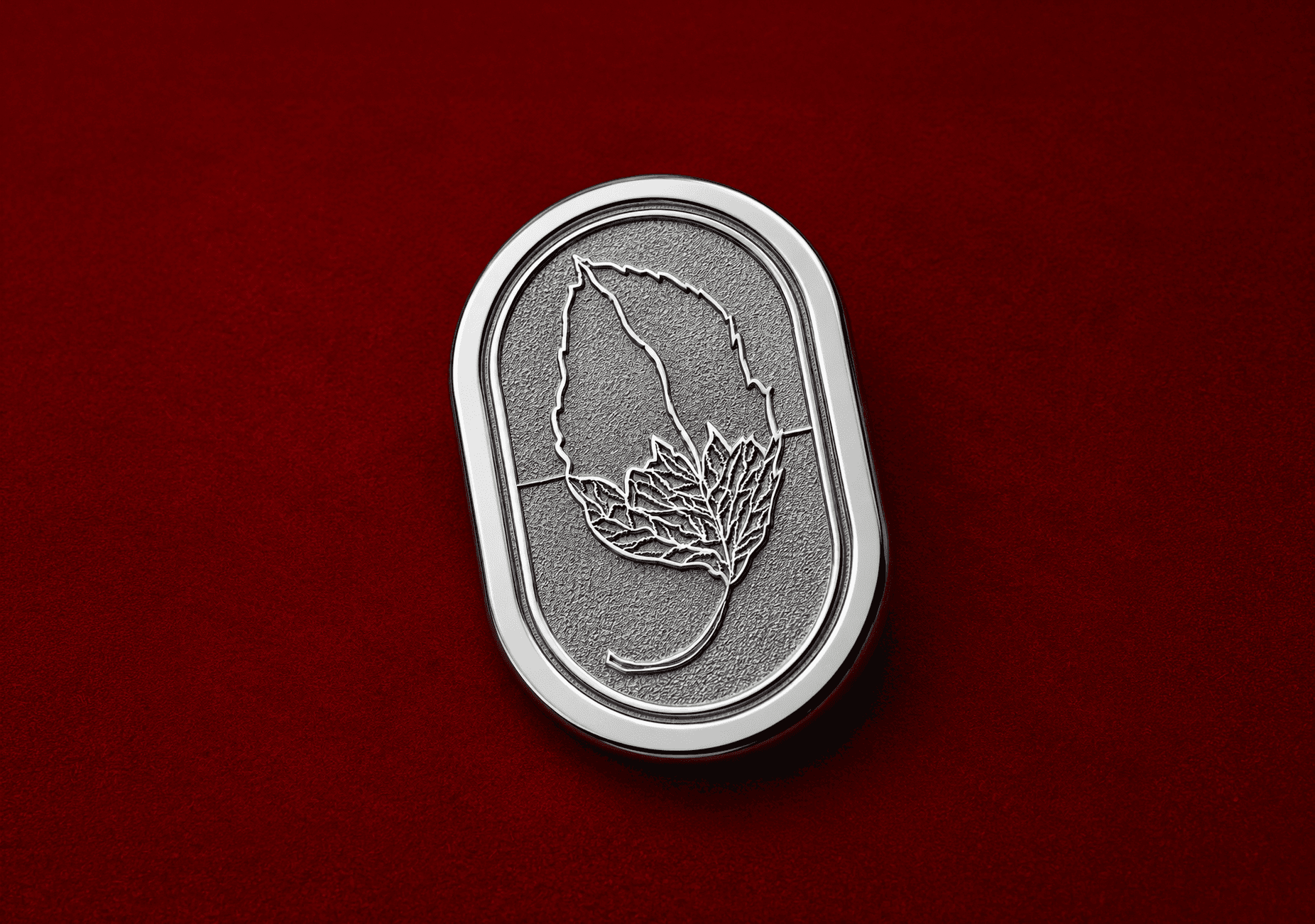
The cytokinin emblem
A visual nod to Pyratine’s botanical roots and patented cytokinin innovation. This symbol blends nature and science-the upper leaf representing origin, the lower segment representing molecular refinement-capturing the essence of clinically proven, plant-powered skincare.


Results and Success
✅ A Brand that looks as smart as it is: The new identity finally reflects Pyratine’s clinical credibility - no more disconnect between product performance and visual presence.
✅ Packaging that builds trust (and stands out): Clean design, metallic finishes, and premium cues helped Pyratine hold its own in both medical and high-end retail settings.
✅ Clarity across the product line: A unified system across Pyratine 6 and XR reinforces consistency, confidence, and cross-product recognition.
✅ Design that signals results: Strategic use of pharmaceutical-inspired design language communicates safety, efficacy, and scientific authority at first glance
✅ Ready for bigger markets: The new brand identity isn’t just pretty - it’s built to scale. Pyratine is now equipped for global expansion and stronger positioning in the clinical skincare category


What PYRATINE Thinks About Working With Us