Branding a café for night owls
Noctua is a new café built for night owls, not another cozy coffee spot. We named it, then built a bold, street-driven identity to match.
Type
Services & Industry

Street-driven identity to wake up Prague’s coffee scene
Noctua, a new café rooted in Prague’s urban culture, needed a brand that hit harder than a double espresso. The goal? Create a bold, street-driven identity that speaks to night owls, creatives, and city wanderers - not another minimalist coffee spot. From signage to interiors to takeaway cups, every touchpoint had to feel raw, magnetic, and unmistakably Noctua.


Objectives
Build a bold, street-inspired brand identity with high visual impact
Channel the raw energy of nightlife into every visual element
Create cohesive branding across interior, exterior, and packaging touchpoints
Make the brand instantly recognizable in a saturated café market
Design a visual language that reflects community, culture, and local edge


Step 1: Crafting a brand that speaks after dark
The Naming Story
We didn’t want a name that just describes a café.
We wanted a name that feels like 2AM. Still. Sharp. Charged. Noctua - Latin for “night bird” - captured the instinct, mystery, and alertness we were chasing.
It’s a symbol for night-minded souls — thinkers, wanderers, creatives. A name with edge, elegance, and instinct. Rooted in the quiet power of the night, even when the sun is up.


Step 2: Designing the kick
Where bold visuals meet brutal energy
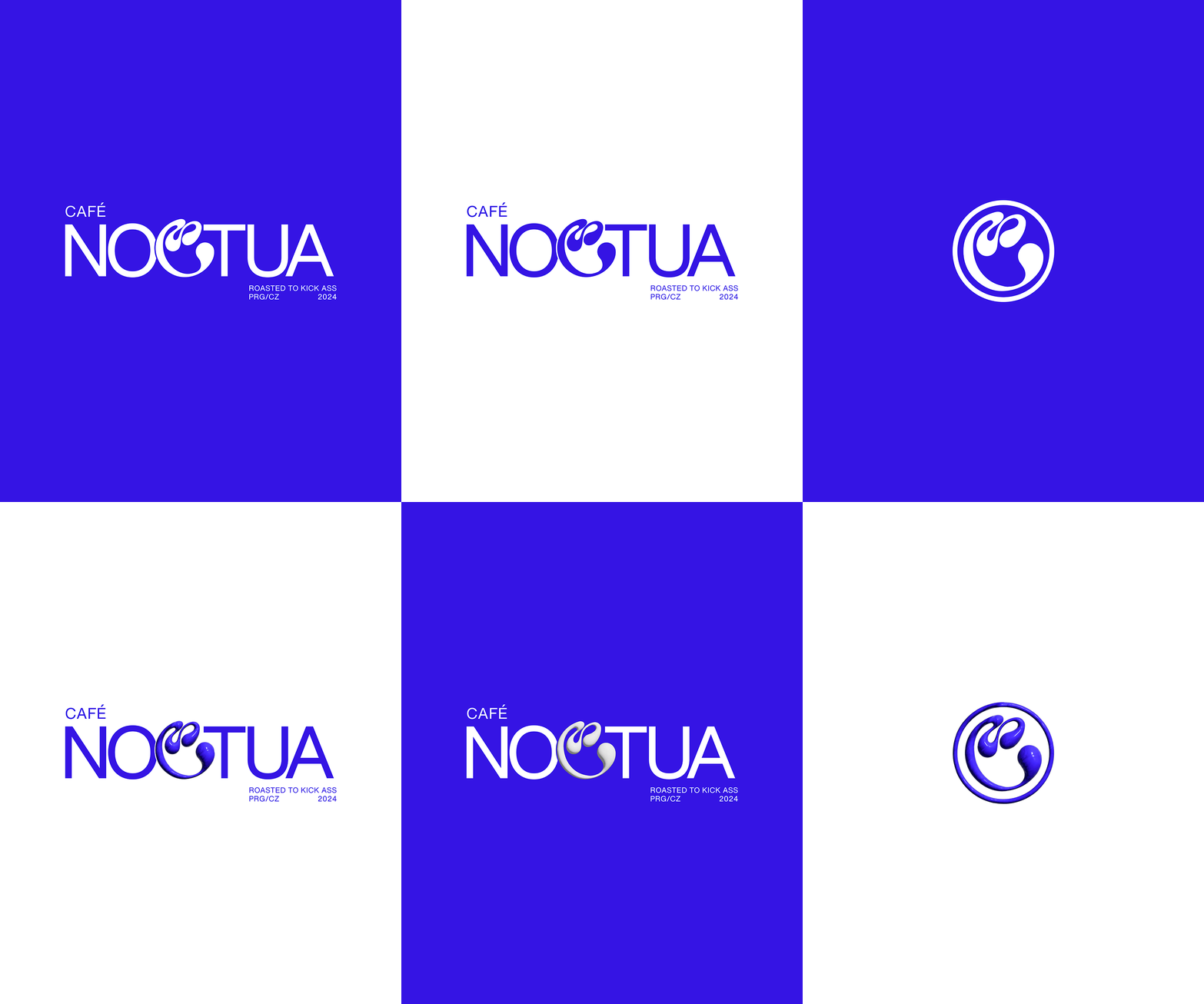
Noctua’s visual identity had to do more than look good - it had to hit. We crafted a logo and design system that feels like a jolt of adrenaline: bold lines, high contrast, street-coded style - fluid like latte art, but with edge.
Inspired by nocturnal instincts and café culture’s raw pulse, the identity is unapologetic, versatile, and built to live across cups, signs, walls, and wearables. This isn’t cozy café branding. This is a visual kickstart.


Step 3: Design that hits before the first sip
Interiors
"From concrete to culture"
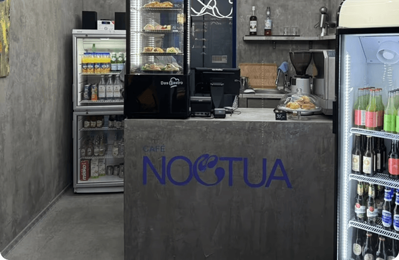
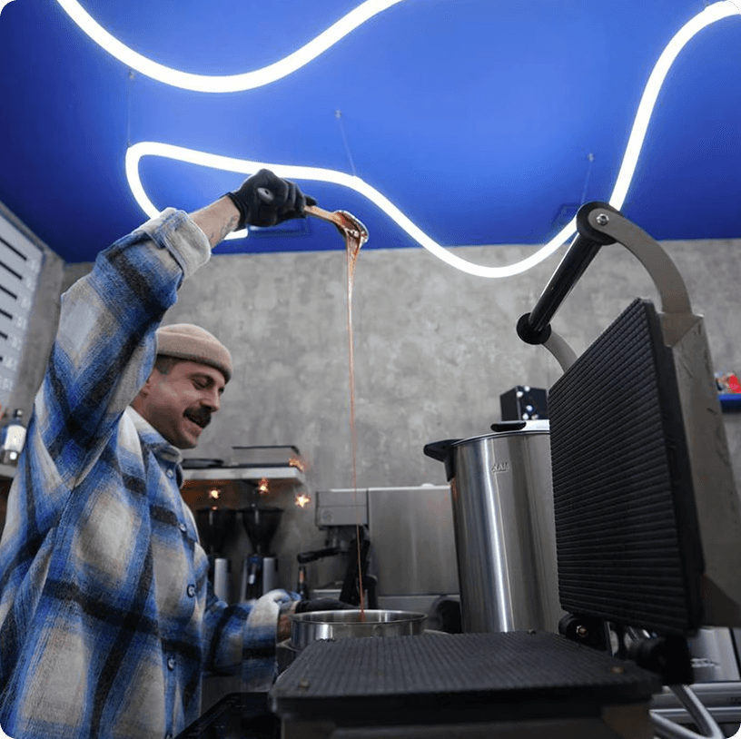
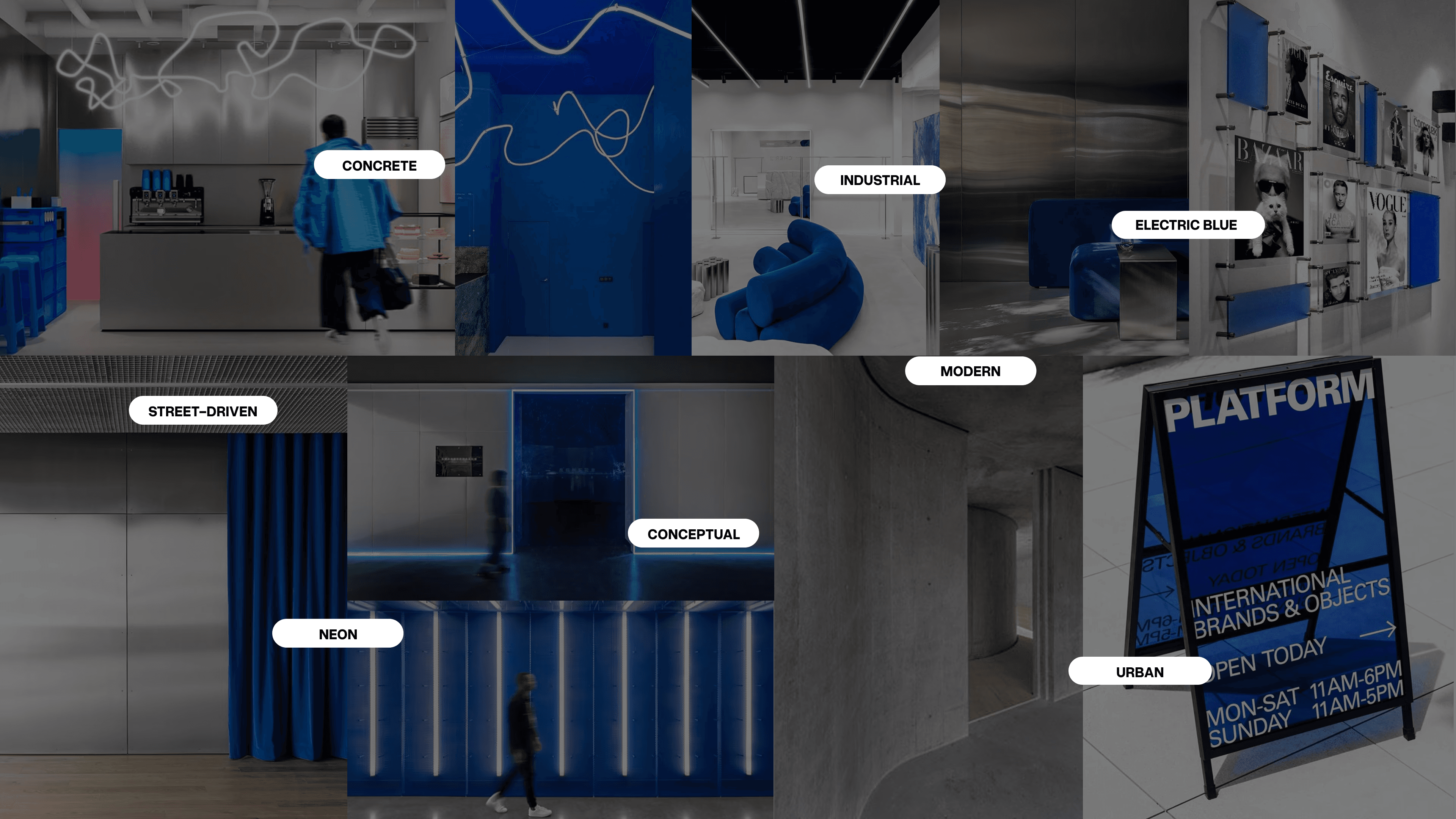
Inside, the fluid energy of Noctua comes alive - bold lightning lines in neon, sculptural forms, and electric blue surfaces create a space that moves. Raw concrete grounds it, while contrast and tension give it pulse. This isn’t another "cozy place" - it’s built to charge you up.
Exteriors
"Street presence with bite"
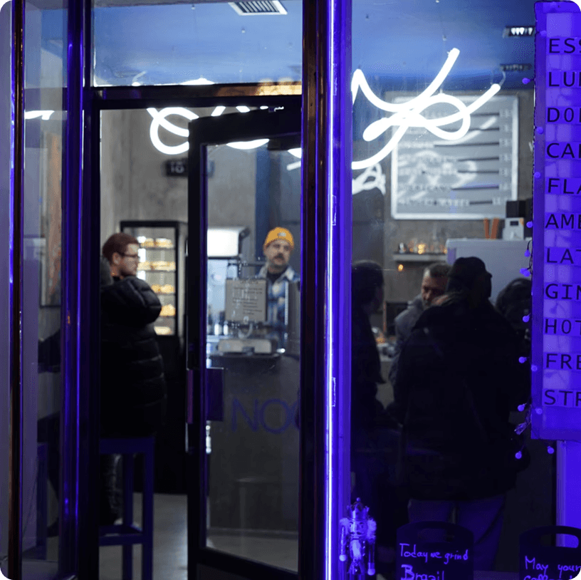
Outside, the brand doesn’t whisper - it pulls you in. Clean signage, high contrast, and an unmistakable identity claim their space on the street. Unapologetic, magnetic, and built to be seen - before the first sip, the brand already makes its mark.

Step 4: Print that packs a punch
Cups that talk back
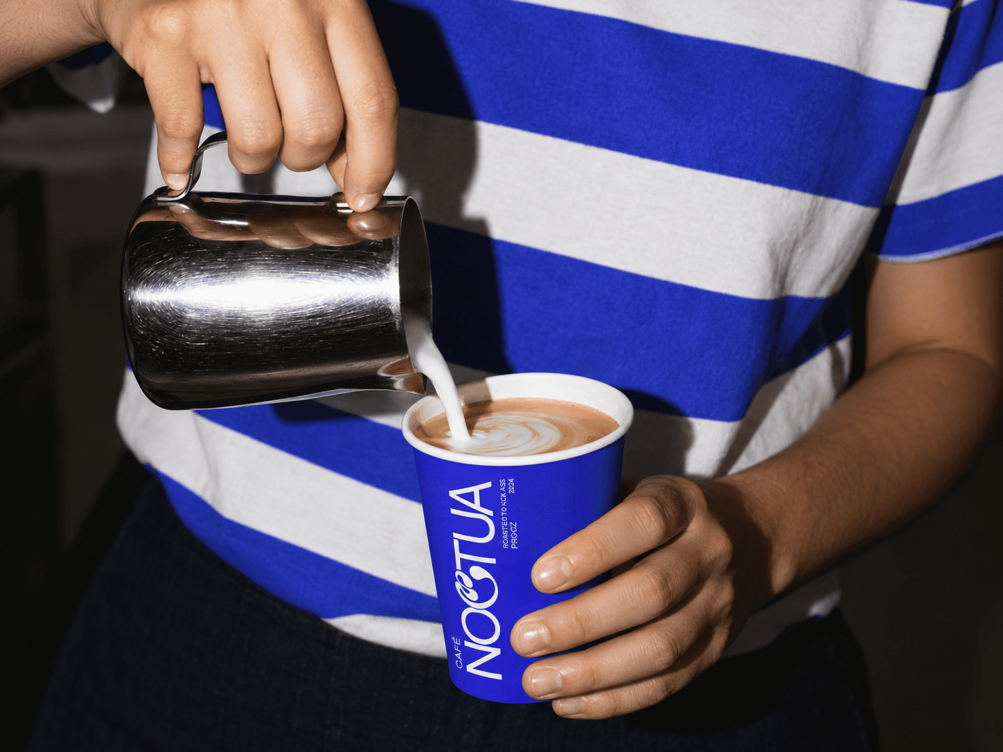
At Noctua, even the coffee cups carry attitude. Designed with bold slogans like “Roasted to Kick Ass”, high-contrast graphics, and unapologetic typography, the cups became walking billboards for the brand. Whether in someone’s hand, on a desk, or in an Instagram story - they deliver instant brand recognition with edge. No detail was too small to flex the vibe.
Stickers, tags & all the extras
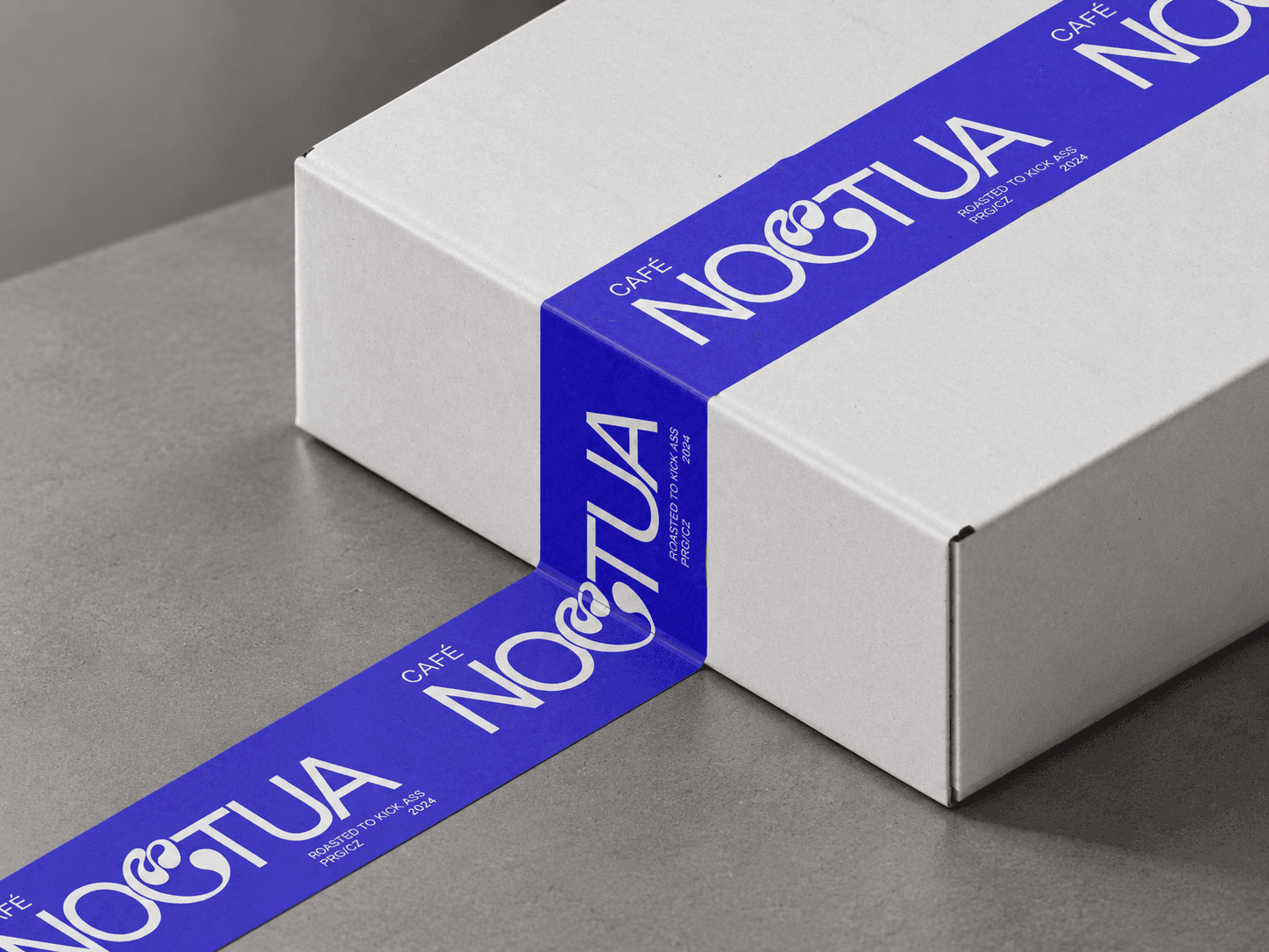
The brand didn’t stop at the bar - it followed customers out the door. From matte-finish stickers to branded merch tags and loyalty cards, every piece was designed to feel intentional and collectible. With street-style cues and punchy one-liners, these materials added personality and presence to every interaction. Print, but make it attitude.


Results and success
✅ Recognizable identity: Noctua quickly stood out in Prague’s café scene.
✅ Cultural impact: The space became a creative hub, not just a coffee stop.
✅ Shareable moments: Design details sparked organic social content.
✅ Brand consistency: Every touchpoint spoke the same bold language.
✅ Visual ownership: The look is distinct, extendable, and unmistakably Noctua.
✅ Market disruption: Noctua challenged the soft café norm with street-style edge.