From niche craft shop to category leader
Manumi began as Korálky.cz, a Czech e-commerce brand known for beads and jewelry components, then grew into a broader DIY platform. We created the new name, strategy and modular identity to unlock a wider creative audience and product universe.
Type
Services & Industry

Rebranding Manumi: From beads to a new era of DIY
Korálky.cz, meaning “beads” in Czech, launched in 2008 as a go-to source for glass beads and jewelry components. As the brand grew into a broader DIY and creative hub, the original name and identity no longer fit. They felt too narrow for today’s modern, lifestyle-driven maker.
The solution was a complete rebrand: new strategy, new name, new visual identity, and a broader audience. We created a modular design system that feels as creative, dynamic, and modern as the makers Manumi serves.


Step 1: Naming a new creative era
From literal to limitless
Korálky.cz - “beads” in Czech - was a name tied to just one product. But the brand had grown far beyond that. It’s a common trap: naming your business after where you start, not where you’re headed. As the DIY universe expanded, the name held the brand back. We needed a name that could grow with it - and signal the full creative potential.
Manumi: Made to make
Inspired by the Czech phrase “manuální tvoření miluju” (“I love manual crafting”), we developed the name Manumi to express the emotional core of the brand. It’s warm, playful, and easy to pronounce - crafted to resonate across markets and grow with the brand. More than a name, it’s a mindset. Built for movement, for making, and for bold brand growth.


Step 2: Building a brand that sparks creativity
Inspiration comes first
Manumi exists to awaken creativity - not just in seasoned makers, but in anyone curious to try. The brand is emotional, inviting, and rooted in inspiration. It empowers people to explore, experiment, and enjoy the process.
A brand you can grow with
Whether it’s your first project or your hundredth, Manumi feels like a creative ally. It’s built to meet people where they are, share their excitement, and provide everything they need to turn ideas into something real.
Core elements of the Manumi brand system
Natural materials
Distinctive color palette
Handmade approach
Playful copy
Modularity


Step 3: Identity that inspires creation
A logo that balances structure and soul
The Manumi logo was designed to be clean, confident, and instantly recognizable - while still carrying a sense of warmth and creativity.
Its geometric structure reflects clarity and professionalism, while the soft curves and modular versions give it flexibility across every format, from packaging to social content.
Each form (primary, secondary, and symbol) was built to scale and adapt, without ever losing its personality.


Perfectly imperfect by design
Manumi celebrates individuality through a handmade visual system. Instead of chasing symmetry or pixel-perfection, we embraced human touch. If a hundred people cut out the letter “M”, we’d get a hundred different results-and that’s the point. We skipped rigid geometry and picked up scissors, cutting each shape by hand to build a brand rooted in creativity, not conformity.
Shapes that speak Manumi
From those hand-cut forms, we created a distinctive shape library-used across Manumi’s identity. The shapes are bold, irregular, and emotionally expressive-some rounded, some sharp-all inspired by the letters in “Manumi.” This system becomes a visual signature: instantly recognizable, endlessly adaptable, and full of personality.
Typography with a Twist
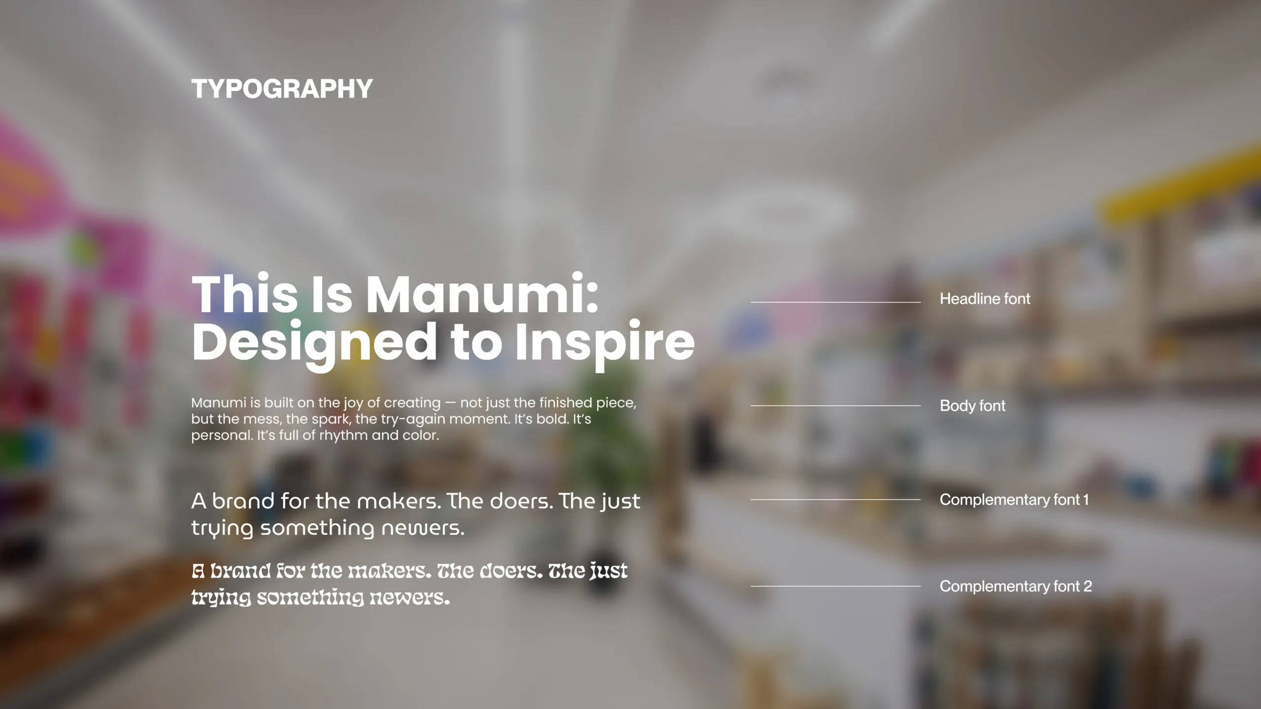
Manumi’s typographic system was designed to feel expressive and handcrafted - just like the DIY world it represents. We combined a clean, modern sans-serif with quirky, custom letterforms and playful typographic styling. This allows the brand to shift tone fluidly, from simple and functional to loud and characterful while always staying recognizably Manumi.
Stickers That Speak
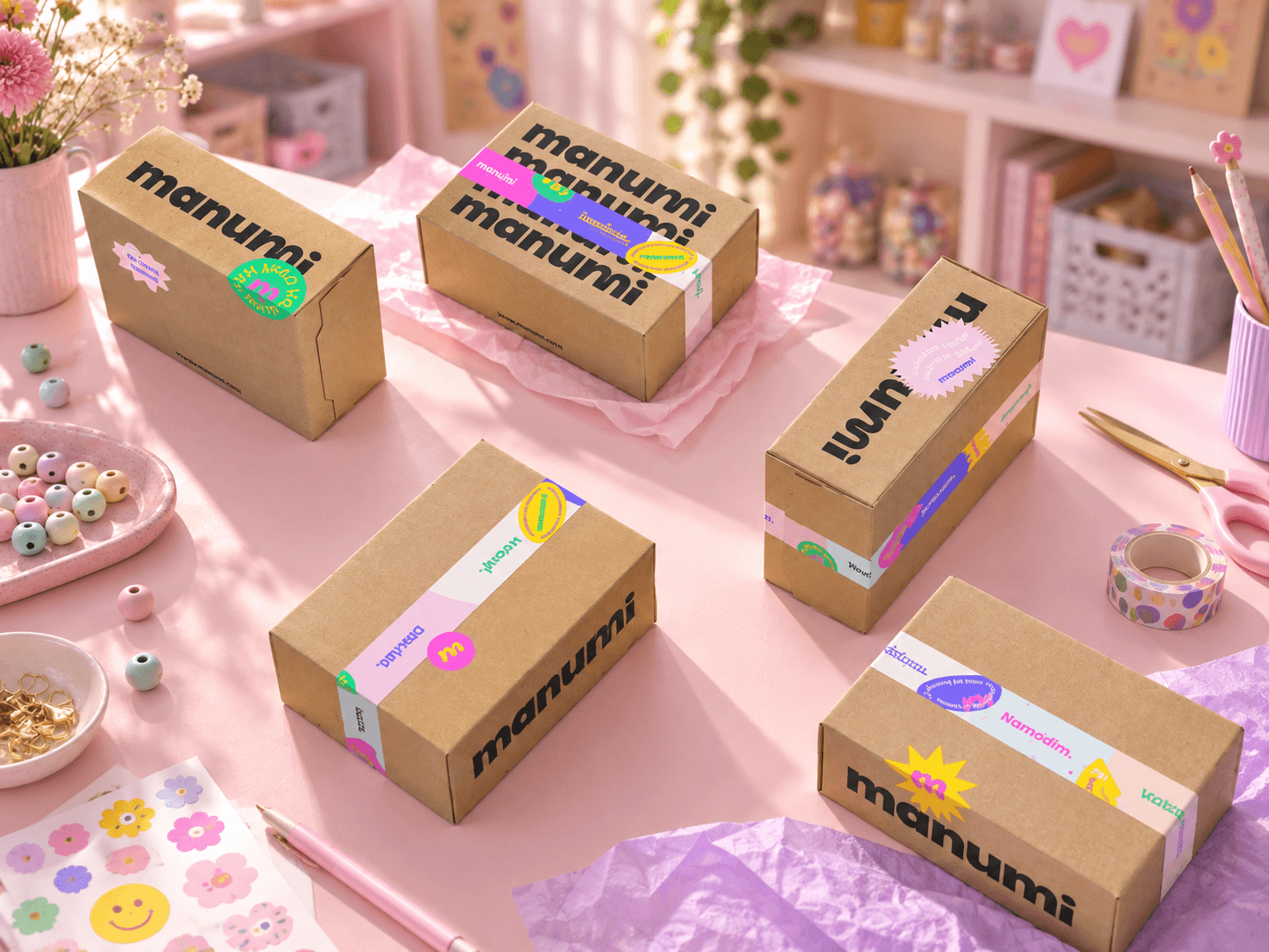
Stickers aren’t just a detail - they’re the core element of the Manumi identity. Each one combines hand-cut shapes with distinctive typography and playful, fun copywriting. Whether it’s a joyful phrase, a gentle prompt, or a bold statement, the stickers bring color, voice, and personality into every brand touchpoint. They make the brand feel alive - personal, expressive, and fun to interact with.



Step 4: A modular system built for creativity
A DIY identity system
We approached the Manumi visual identity the same way its customers approach their projects: creatively, playfully, and hands-on.
The entire system was designed like a DIY kit-modular, flexible, and open to interpretation. From stickers and shapes to typography and color, every element is meant to be combined, rearranged, and played with.
Made to be remixed
This is not a rigid identity-it’s an open platform. While it has strong recognizability, it invites creators to make it their own. Anyone working with the brand can remix the components to reflect their tone, mood, or message. Just like a great DIY project, the final expression is always personal.



Step 5: Bringing the brand into the world
Shops that feel like Manumi
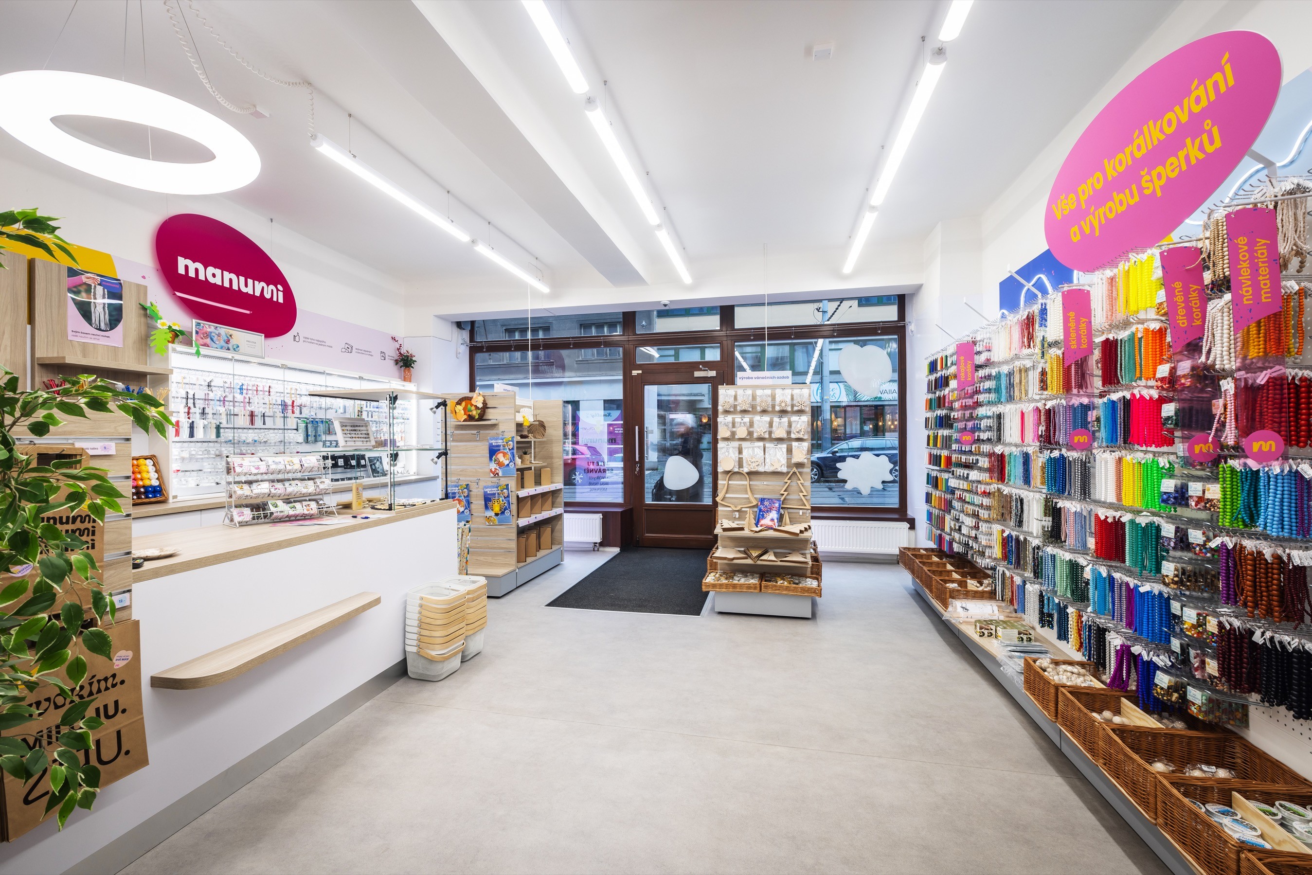
Manumi is the largest online seller of DIY supplies in the Czech Republic and also operates six physical stores. Each location was redesigned with the new identity system, bringing the brand’s playful creativity into natural textures, bold shapes, and welcoming in-store details.
Consistency you can walk into
Thanks to the modular visual system, the identity translated easily into physical stores. Storefronts, shelf labels, stickers, typography, and color created a cohesive retail space that feels expressive, recognizable, and unmistakably Manumi.


Step 6: A new era of making
After the rebrand, Manumi launched ready-made DIY kits built around complete creative experiences, not just materials. We created a modular visual framework that the internal team could easily adapt across different project types.
The system makes launching new kits faster, more flexible, and consistently on-brand. Instead of selling loose parts, Manumi can now offer joyful, beginner-friendly moments to enjoy alone, with friends, or with family.

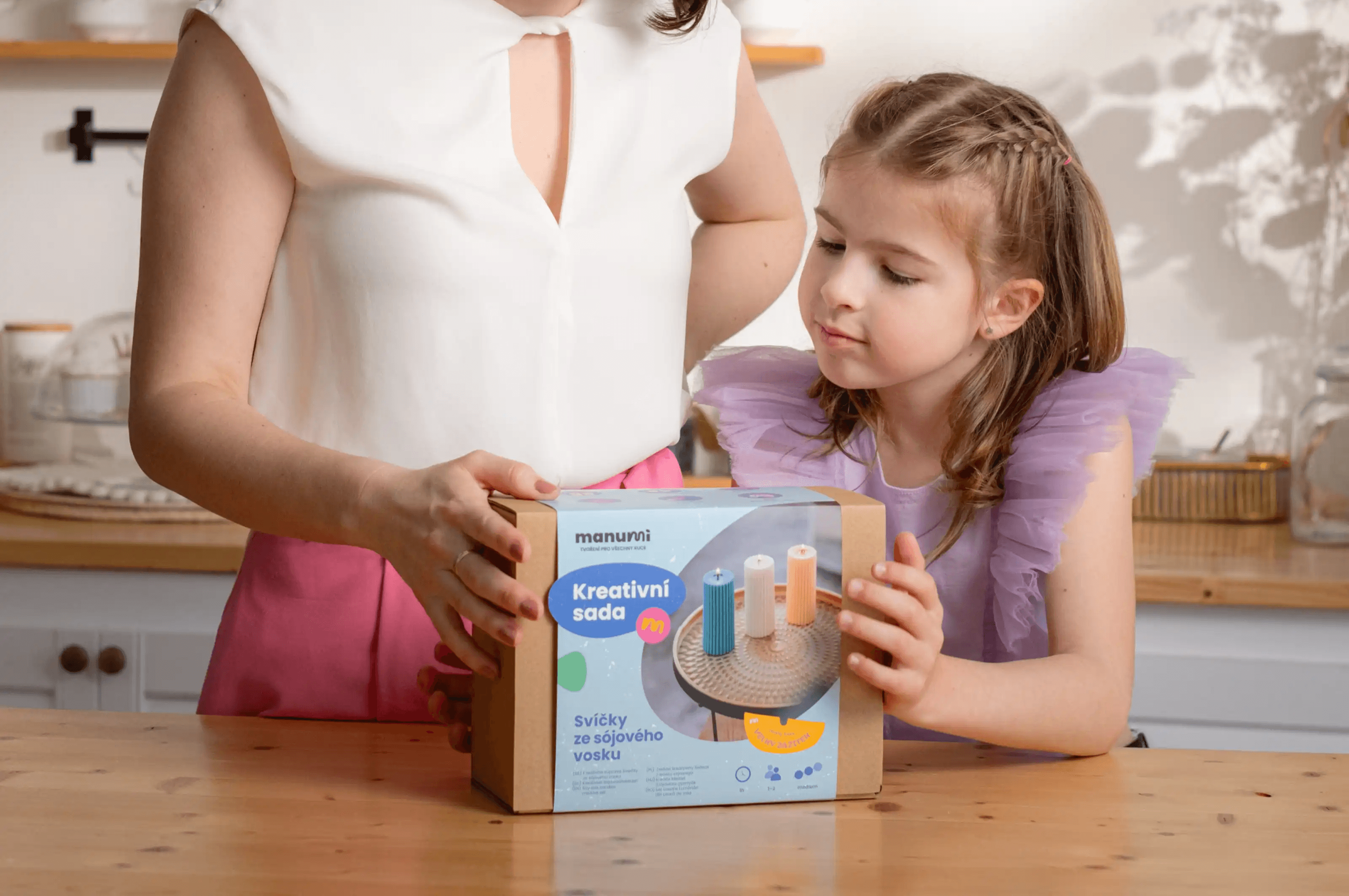
A scalable system, built for creativity
We created a flexible sleeve template that makes every kit instantly recognizable while allowing for endless variation. The front side clearly communicates the project outcome, who it’s for, and the experience level-making it easy for customers to choose the right kit at a glance.
The reverse side visualizes all included materials in a clean, modular layout. This system not only improves usability and shelf appeal, but also empowers the Manumi team to scale the product line efficiently-while keeping every touchpoint visually aligned with the brand.
A visual language that speaks to everyone
We designed a custom icon library to help Manumi communicate the value of each kit at a glance. From difficulty and time required to use cases like “perfect gift” or “better together,” the icons form a modular system that adapts to different audiences and occasions-while keeping everything visually consistent and easy to understand.
Instruction manuals made simple
To support the growing kit line, we created customizable templates for instructional booklets. Each layout includes space for step-by-step visuals, a project overview, and photo guidance-making it easy for the internal team to create clear, branded manuals for any DIY experience.


Results and success
A visual language that speaks to everyone
We designed a custom icon library to help Manumi communicate the value of each kit at a glance. From difficulty and time required to use cases like “perfect gift” or “better together,” the icons form a modular system that adapts to different audiences and occasions-while keeping everything visually consistent and easy to understand.
Instruction manuals made simple
To support the growing kit line, we created customizable templates for instructional booklets. Each layout includes space for step-by-step visuals, a project overview, and photo guidance-making it easy for the internal team to create clear, branded manuals for any DIY experience.


What MANUMI Thinks About Working With Us