One identity for an iconic mineral water portfolio
Korunní is one of Czechia's best-selling mineral-water brands, rooted in Carlsbad springs and its recognizable crown symbol. After Kofola acquired the brand, we unified its fragmented identity across the portfolio and communication system.
Type
Services & Industry
A clearer identity for an iconic Czech water brand
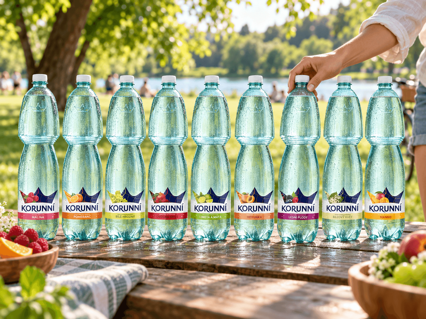
Korunní is one of the best-selling bottled water brands on the Czech market. Acquired by Kofola Československo in 2020, the brand is built around Carlsbad springs and its iconic crown symbol, which has made it recognizable among other bottled water brands for many years.
With the acquisition, it became essential to consolidate Korunní’s fragmented visual identity into one clear and unified style.


A smart choice for everyday balance
Our challenge was to unify Korunní’s visual communication across the entire product portfolio.
Target group
The target group of the brand are people from 25 to 55 years: responsible, open-minded, looking for life balance. Balance - visual, mental and physical - is what inspired our visual approach.
Consumer insight
Korunní has always been perceived for its quality for affordable price. Taken this advantage of the resounding positioning we aimed to conceptualize the product as a smart-choice. A product that the customer will be delighted to carry throughout the day.


Pillars of a unified brand system
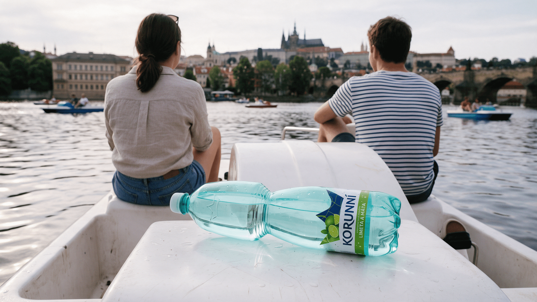
Visibility and consistency: Iconic, distinctive, and clean design, together with visual consistency, became the main pillars of the rebrand. Keeping the block effect in mind, we made sure Korunní stays clearly recognizable among other brands on the shelf.
Brand recognition: The name Korunní refers to the crown itself, so we brought this significant brand symbol to the foreground. The goal was to reshape the former design into a clear, modern, and confident look that customers can instantly recognize.
Smart choice for city lifestyle: Our intention was to make the decision-making process easier for a busy city lifestyle. Through an iconic, simple, and distinctive design, Korunní became a balanced and smart choice - go-to water for on-the-go people.


Design clear just as the water
Korunní is mineral rich water that keeps your mind crystal clear and day perfectly balanced. It is the right product for everyday matters that understands the busy lifestyle and brings quality refreshment for both mind and body. Your private oasis, a break from a hustle and bustle of the city.


Concept better city experience
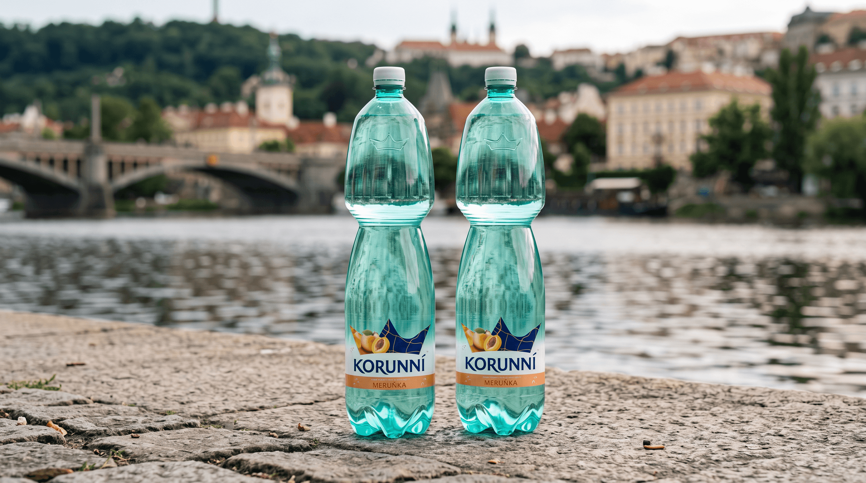
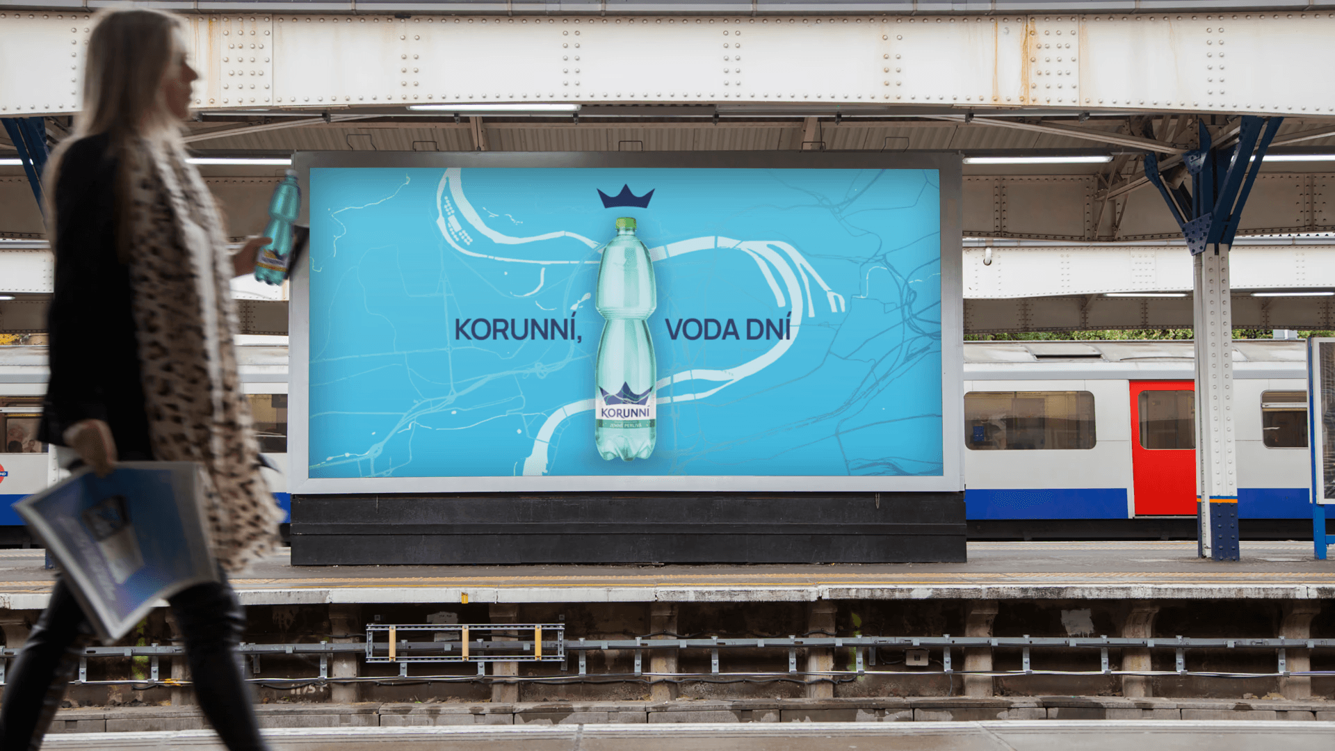
Korunní flows through your everyday routine, connects the city life together and refines it into a unique experience. That is communicated through the distinctive spring that touches every element of the rush city lifestyle, either if it’s work or personal life. The connection is visually represented as a thoughtful visual approach, literally flowing through all product labels.
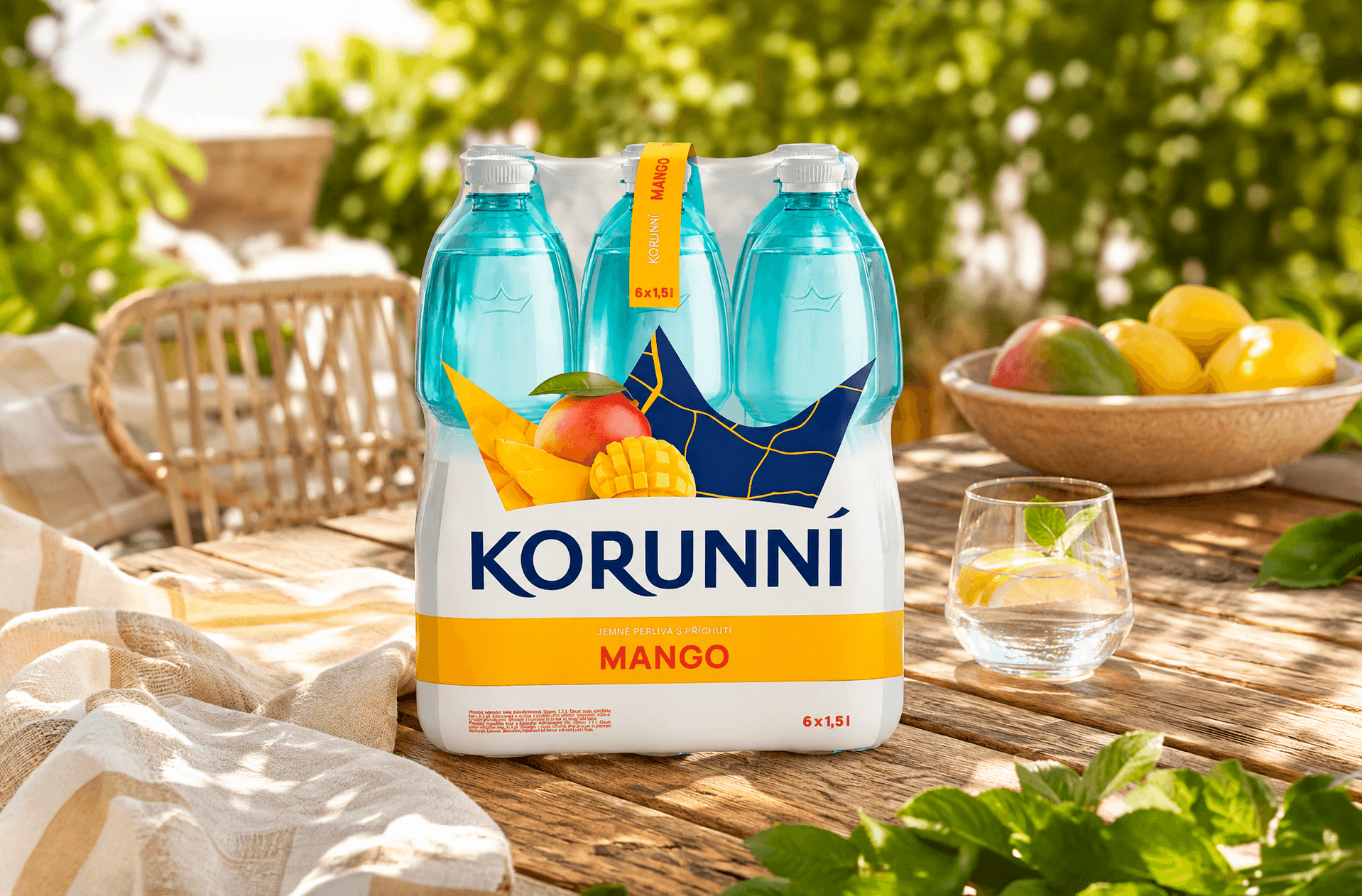
With special “interest points” the intention was to reflect the level of carbonation of a particular product. From soft to distinct design elements as a form of visual interpretation of the water effervescence.


Branding across every surface
Apart from the core visuals, the six pack bottle packaging has been created to let the branding fully resonate on any surface of the Korunní brand. A key visual was created to complement the branding for further communication, carrying and reflecting the principal message in a broader format.



2024: FUNCTIONAL ON-THE-GO WATER
Discover how we helped Korunní penetrate a new market by designing a premium and healthy line of on-the-go beverages with impulse-buy appeal.
Learn more about Korunní's functional water here.