Building a logistics brand for scale
Haangar is a logistics and fulfillment partner helping brands move from warehouse to market across borders. We created a bold, technical identity designed to stay consistent on trucks, boxes, warehouse signage and digital communication.
Type
Services & Industry
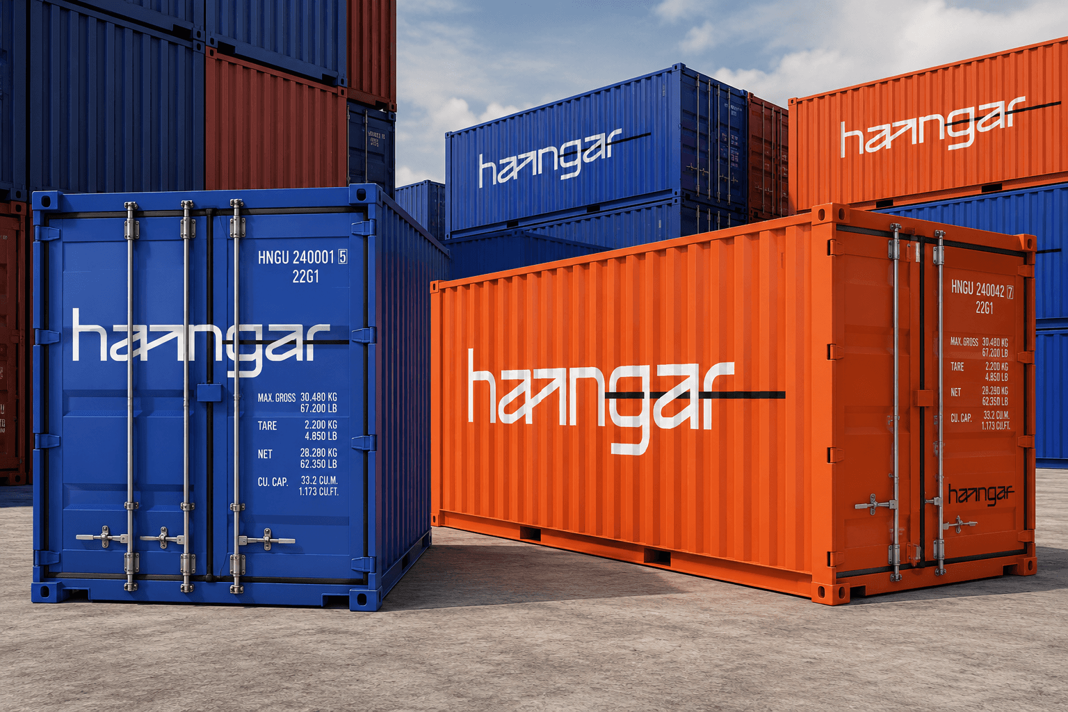
A logistics brand built for speed and scale
The goal was to create a bold, modern identity that feels confident, technical, and ready for international growth. Haangar needed to look reliable and professional, but also fast, direct, and easy to recognize in real-world logistics environments.
The visual system had to work across many touchpoints - from trucks, boxes, tape, and warehouse signage to stationery and digital communication. Every element needed to be simple to apply, but strong enough to make the brand feel consistent wherever it appears.


Step 1: Defining the brand direction
We started by focusing on what Haangar stands for: speed, precision, reliability, and scalable logistics support. The brand needed to speak to businesses that depend on smooth operations and need a partner capable of helping them grow.
This shaped the identity around clarity and momentum. Instead of decorative design, we built a visual direction that feels efficient, structured, and no-nonsense - just like the service Haangar provides.



Step 2: Creating a technical wordmark
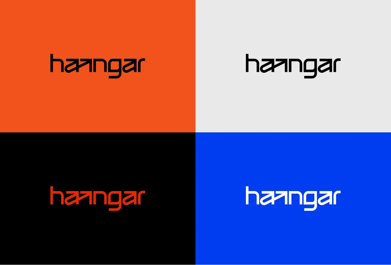
At the center of the identity is a clean, technical wordmark with a distinctive directional arrow cut. This detail captures movement, delivery, and forward momentum, while making the logo more ownable and recognizable.
The wordmark was designed to feel precise and modern, working clearly across both small and large formats - from digital touchpoints to warehouse signage, packaging, labels, and vehicles.


Step 3: Building a practical visual system
The visual system uses a high-contrast palette, strong typography, and clear grid rules to create consistency across all materials. The design feels bold and contemporary, but remains highly practical for daily use by different teams.
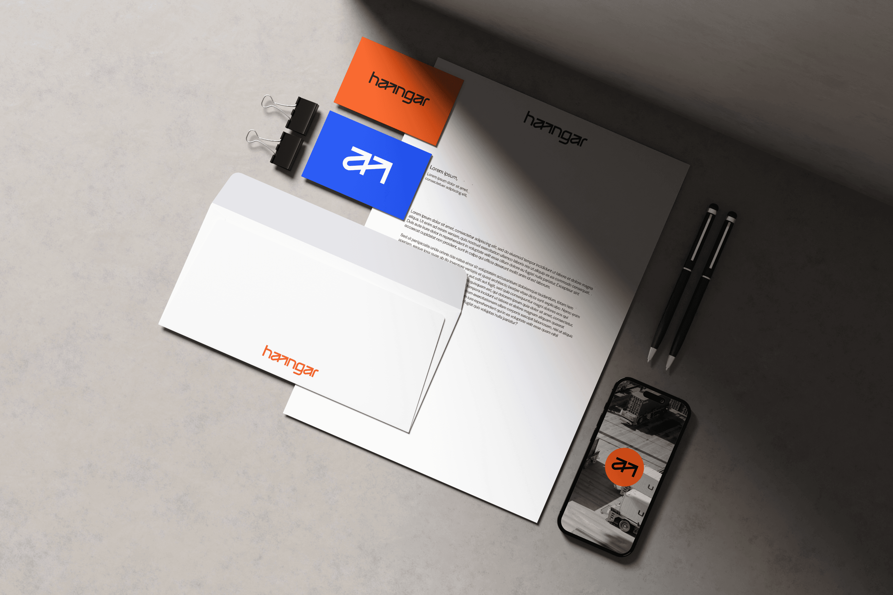
This makes it easy to apply the identity across boxes, shipping tape, trucks, warehouse elements, stationery, and online communication without losing quality or recognition.


Step 4: Bringing the brand into motion
Because Haangar operates in a world of movement, the identity was designed to feel active wherever it appears. On trucks, packaging, and warehouse signage, the directional logo detail and strong layouts help communicate speed, order, and reliability.
The result is a brand that works from warehouse to city streets - clear, confident, and built to support growth across markets.


Results and success
✅ Stronger brand recognition: Haangar gained a bold and memorable identity that is easy to recognize across logistics, packaging, vehicles, and digital touchpoints.
✅ Clearer communication of speed: The directional arrow cut and structured visual system communicate movement, precision, and efficient delivery.
✅ Practical everyday system: The identity is simple to apply across teams, materials, and formats without losing consistency.
✅ Professional logistics presence: High contrast, strong typography, and technical details make the brand feel reliable, modern, and ready for serious business.
✅ Consistency across touchpoints: Trucks, boxes, tape, warehouse signage, stationery, and online assets now speak one clear visual language.
✅ Ready for international growth: The system gives Haangar a scalable foundation for expansion beyond borders.