Rebranding intimate care with empathy
Gynella is a brand from a pharmaceutical company Heaton, offering intimate-care products and education for women. We created an empathetic identity, brand platform, website and communication system that makes sensitive topics easier to discuss.
Type
Services & Industry

Challenge
Women are often reluctant to talk openly about problems related to intimate parts. We know how much these problems burden women and at the same time how afraid they are to talk about it. So our task was nothing less than to break the taboo of female intimacy. Specifically: to create a visual and communication style of the brand that will be understanding, nice, explanatory and relatable. Both online and offline, without changing the current product packaging.


About the brand Gynella
Gynella provides a complex intimate care for women. It belongs to the portfolio of the Czech family pharmaceutical company Heaton.
In its product portfolio, it offers e.g. intimate washing gels, foams, vaginal capsules, suppositories, tablets, dietary supplements, etc. But it is not just a pharmaceutical company - it tries to break taboos in the field of female intimacy, vaginal inflammation and other problems, and tries to educate all Czech and Slovak women.



Gynella creates a feeling of intimacy, trust and friendship.
Gynella is here for every woman without exception. We want to talk about these topics openly and create an environment where women don't have to be ashamed of their issues #downthere. We came up with a solution that is understandable, responds with brand values and directly encourages an open friendly conversation. Even about the most confidential problems.


A friend on the other side
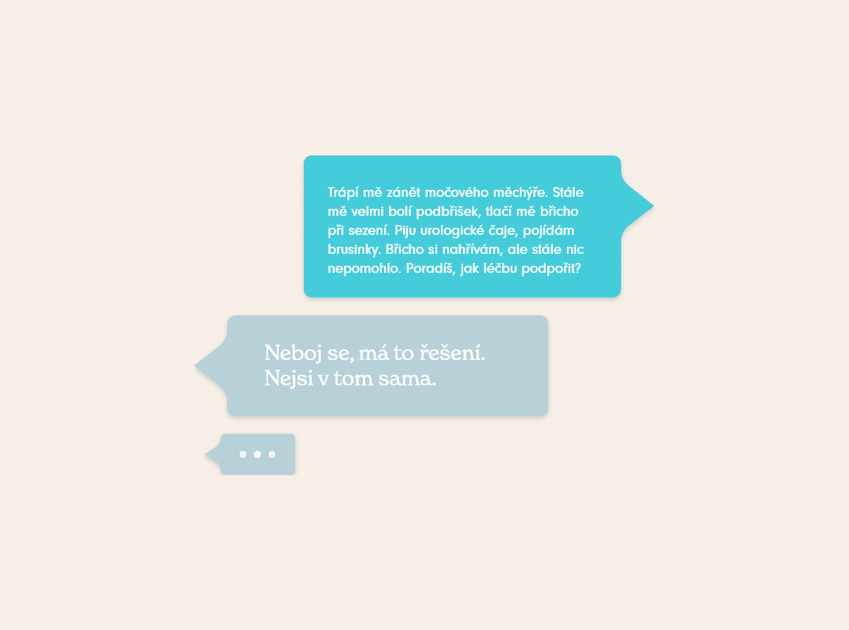
We came up with a unique solution that helps to effectively communicate the sensitive area of intimate care. Communication in general is crucial, especially when it comes to such a personal topic. That's why we think of the overall rebrand as a 1:1 conversation between women and women. Gynella is the friend on the other side who will answer every question, even when we are too shy to ask it. Gynella answers, listens, understands, reassures and offer a solution.


Who is Gynella?
The Gynella brand communicates in the first form narrative, as a persona - woman Gynella. If we imagine her as a person, she is a 43-year-old woman, married for the second time with two children. Friendly and human, she always speaks openly and honestly, she's just her own. She is empathetic and has a great life experience. She can advise and recommend.
She doesn't give up on life, doesn't resign, she wants to fight. She is funny and can always cheer you up. She is our friend on the other side that we can trust.


Visual solution
Gynella is a friend we can trust with everything.
Subconsciously, we communicate pleasant feelings associated with relief from pain and discomfort associated with the problems #downthere. Gynella heals and brings relief. The visual style is very clean, we use soft colors and soft rounded shapes. We work with photographs of bare skin, evoking human warmth and intimacy.


New logo
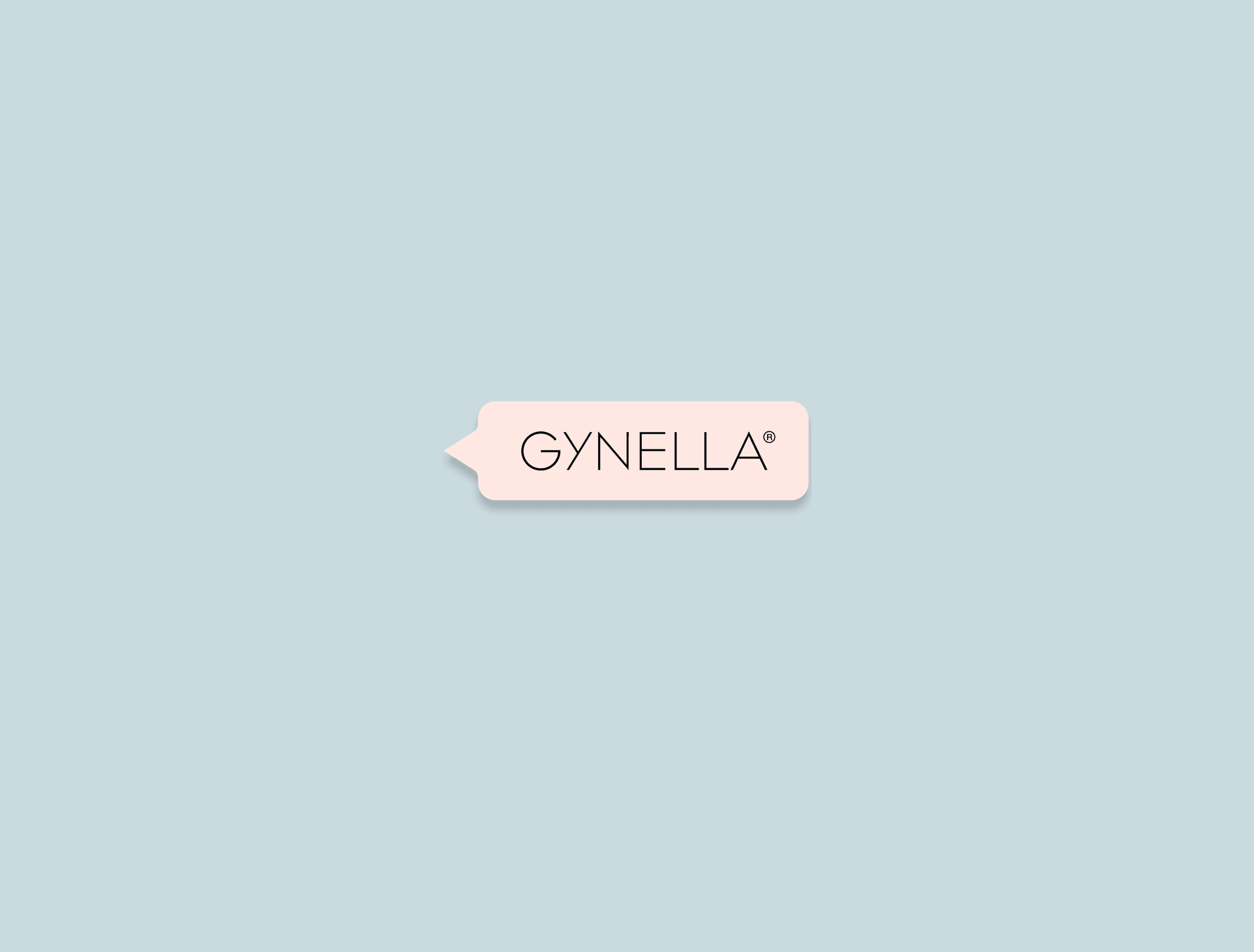
The brand's visual identity represents a relationship based on trust and understanding. The new logo is based on the original logotype, which is used on current products and packaging. However, it expands it with the communication element of the conversation bubble, which reflects openness and interaction with the brand - a woman - a friend Gynella.


Interaction & conversations ice-breakers
We use elements from virtual communication in visual communication. Who among us has never searched for a question in an anonymous browser window that made them blush? Gynella totally understands that. Therefore, we work with a search bar, confidential conversations, opportunities to ask anonymous questions or personal tips for saving.
Custom brand illustrations
We designed a series of simplified illustrations of women's bodies. They soften the visuals, give them an intimate touch and evoke the theme of the brand. The illustrations are very suggestive and symbolic. The chosen technique looks as if the characters were drawn with a finger with cream.


Color palette
The base of the new brand palette are soft and feminine colors, especially various shades of brown, beige and pink. These colors create a soothing and harmonious impression, evoking human skin. The palette is complemented by vivid colors that are based on the products and their packaging. In combination, they create a unique brand color palette that contributes to brand recognition and subconsciously communicates a pleasant feeling of relief, femininity and intimacy.


Web redesign encourages conversation
The new website redesign creates an open platform that breaks the taboo related to female intimacy. It's a safe place for women to safely find answers to all of their questions about everything #downthere and, of course, specific products that address their concerns. The website design emphasizes clarity and a pleasant atmosphere. It supports the overall vision of Gynella as a communicative and open place for women who want to be #carefree.


Creative full-service
As part of the NUAGENCÍA agency (created by connection of the branding studio Heels Make Deals and the production agency Mañana production), we took care of the production and art direction of new product and lifestyle photos. Product photos feel clean, personal and intimate. We display the products in connection with a woman's body or in her hands on a clean background in brand colors. We feature all women of all ages and looks. We also work with visual metaphors of the health problems that Gynella helps to solve.


Product videos
NUAgencía was also involved in the video production and art direction. We created a series of lifestyle spots for Gynella, which presented the brand's products as effective solutions to urgent problems - all united under the concept of communication with our friend Gynella. The final spots were published on online platforms and social networks.