Making circular packaging easy to recognize
Cirkulka is Kofola's returnable glass-bottle system for bringing circularity into everyday beverage shopping. We created the logo and visual identity to make the reuse model simple, distinctive and recognizable across bottles, crates and retail.
Type
Services & Industry

About the project
We care for our planet and are always more than happy to join forces with our clients in order to relieve the environment. Our long term client, Kofola a.s., as the largest local beverage producer is constantly searching for ways to reduce waste, and has recently launched a project called Cirkulka.
Our studio was responsible for its logo and visual identity. Cirkulka focuses on circular economy and allows customers to enjoy their favorite lemonades in returnable glass bottles - in a circle again and again.


“The creative idea of Heels Make Deals agency lived up to our expectations. It reflects the principle of circularity and propounds our key, but distinctive brands in a simple design.
We were cautious with the launch of the project, but the interest from consumers and the feedback on the well-designed bottles and crates prove that we have got it right and that Cirkulka is the right way to go in the future.”
- Vojtěch Kolmaš, Senior Brand Manager, Kofola a.s.


Logo design
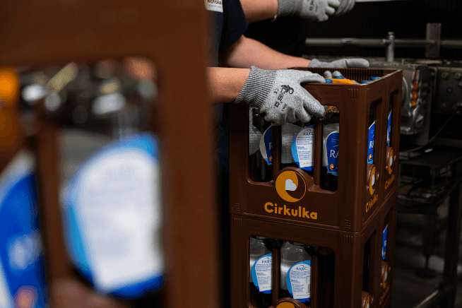
The main motive and unifying element of the design is a symbol that evokes the principle of the cycle, the essence of Cirkulka.
Together with the distinctive heart, it forms the core of the visual identity, which is reflected in various formats from labels to characteristic carrier boxes.
The main color palette of Cirkulka is based on the traditional colors of Kofola to ensure brand recognizability.


Sustainable design
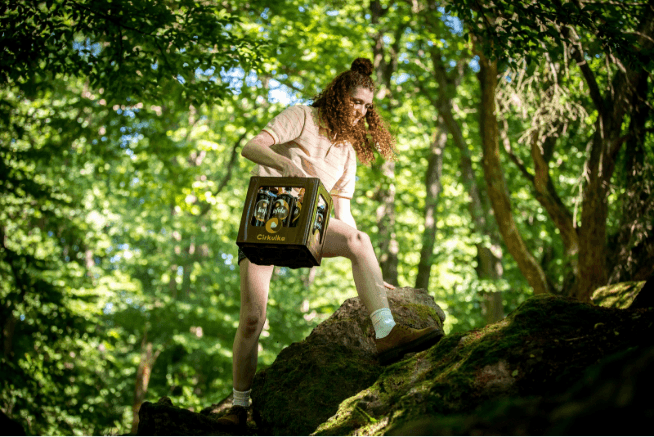
Sustainability is the main idea behind the Cirkulka brand. It connects both returnable glass bottles, in which customers can enjoy love brandy such as Kofola, Vinea or Rajec, and durable branded crates, but also special POS materials.
Using FSC-certified eco-friendly cardboard, special POS materials in Cirkulka's design were created for placement in selected retail stores, thus further separating its product portfolio from other beverages on regular shelves.


POS materials