Claiming the turmeric wellness drink category
Banhi is a cold-pressed turmeric and ginger wellness drink rooted in Ayurvedic practice. We developed its strategy, identity and packaging to turn functional benefits into a distinctive ritual of inner fire for modern wellness consumers.
Type
Services & Industry
Branding a turmeric wellness drink
Turning a functional drink into a brand that channels feminine energy and wellbeing rituals.
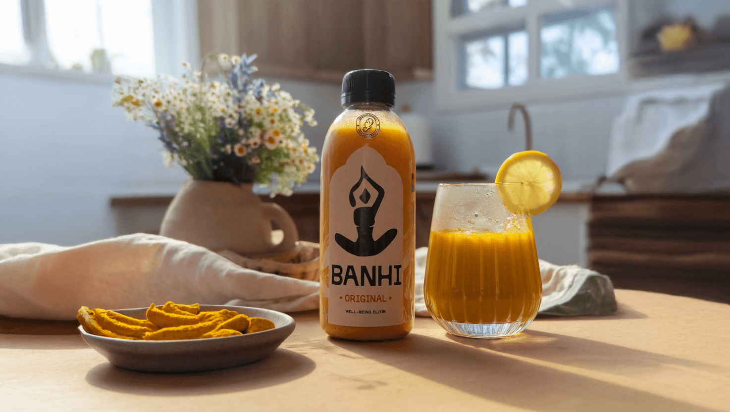
Banhi is a cold-pressed turmeric wellness drink, rooted in Ayurvedic wisdom. Each bottle delivers 68% pure turmeric and ginger, boosted with Ceylon cinnamon and black pepper. No fruit concentrate, no pasteurization.
In close collaboration with Banhi’s founders, we developed the brand strategy, visual identity, and packaging - capturing its powerful health benefits through an emotional, feminine, and ritual-driven lens.

Objectives
Translate Ayurvedic roots into a format that resonates with modern wellness-conscious women
Claim turmeric as Banhi’s hero ingredient-and make it unmistakably theirs
Capture and express a distinctly feminine energy through the brand
Design packaging that stands out in the wellness space by leading with emotion
Build a cohesive brand world grounded in emotional storytelling


Step 1: Igniting Banhi’s brand core
Intimacy, working with emotions, personal approach
Proven health benefits, authentic origin
Inner fire: balance between drive and mental stability
Consumer experience, simplicity, practicality
Personification: Banhi, Indian name for a little girl


Built for her moments
Lili - the grounded caregiver
Finding moments of self-care in the everyday
Aneta is a 32-year-old mother who values wellness, but struggles to carve out time for herself. For her, Banhi is a five-minute ritual between school drop-off and her first meeting-a way to reconnect with her body, spirit, and presence through something simple, nourishing, and beautiful.
Anna - the empowered achiever
Reclaiming rhythm and inner fire
Markéta is 44, running her own business and rediscovering her independence. Her days are fast, but her self-care is non-negotiable. Banhi is her morning ignition-a wellness anchor that aligns with her values of clarity, strength, and soft power.


Step 2: Giving fire a visual form
A logo born from intention
“Banhi” (बन्हि), meaning fire in Sanskrit, also carries the warmth of a feminine name - and the logo brings that duality to life.
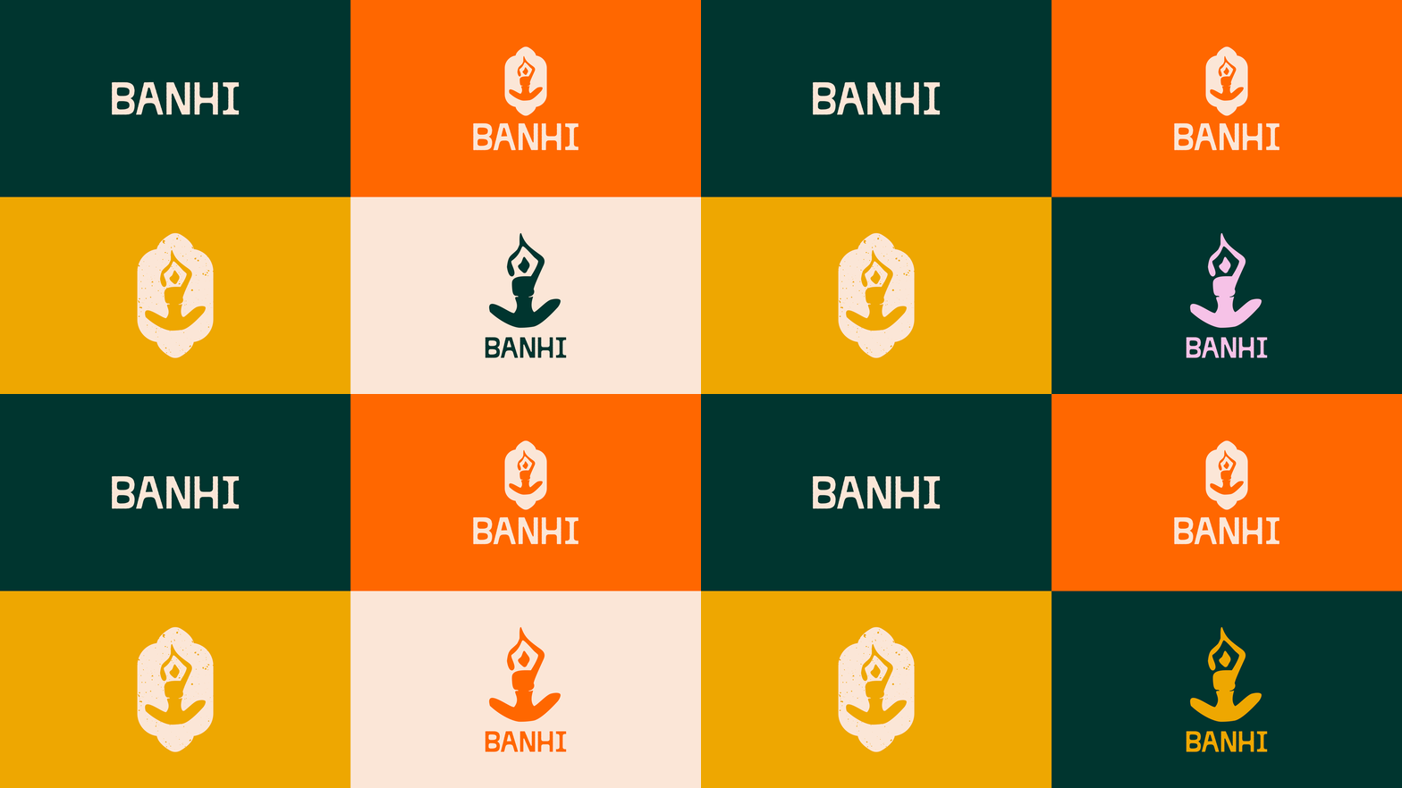
At the heart of the visual identity is a stylized female silhouette: upright, grounded, and quietly powerful. Her posture, echoing the shape of a rising flame, captures Banhi’s core purpose - sparking inner strength through ritual and daily wellness.
More than a symbol, it’s an expression of energy, presence, and feminine vitality.


Step 3: Turning essence into system
A shape that grounds the flame
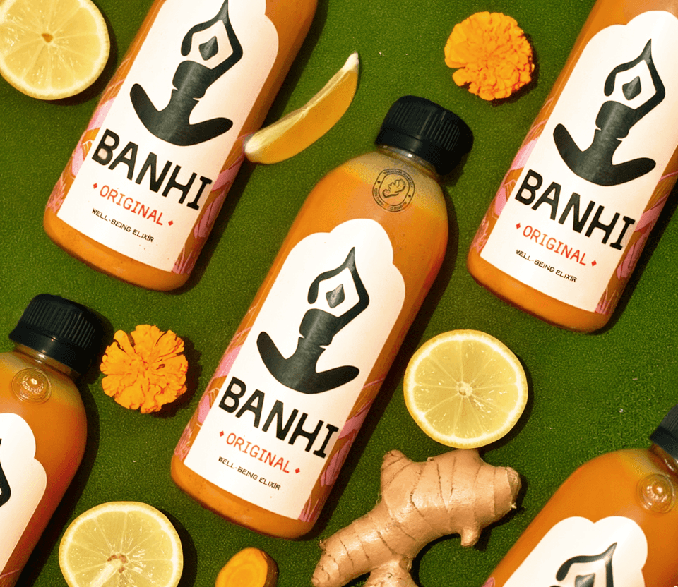
To anchor Banhi’s essence in a cohesive visual system, we created a design language that balances strength with softness. The custom logotype takes cues from traditional letterforms but softens them with subtle imperfections-evoking a sense of warmth, care, and human touch. The central shape used throughout the packaging is inspired by Indian architectural forms, lending a feeling of ritual, place, and cultural grounding.
Color That Feels Like A Sacred Ritual
We drew from nature to shape the palette-choosing hues that evoke nourishment, vitality, and quiet power. Soft purple and lilac tones reflect the gentle bloom of turmeric blossoms, while the rich green adds a grounding, earthy contrast. It’s a palette made to feel serene yet alive-perfectly aligned with Banhi’s identity as a modern wellness ritual.


Graphic elements
Botanical, Feminine, Intentional
Hand-drawn turmeric and floral motifs create a soft, recognizable system across labels and visuals. They connect the brand to its Ayurvedic roots while adding emotional depth and organic beauty.
Textures
Grounded in Nature
Natural paper, grainy finishes, and earthy tones echo Banhi’s handcrafted essence. These textures bring a tactile, sensory quality to the brand-rooting it in authenticity and warmth.


Step 4: Ritual, poured and packaged
Bottling the daily ritual
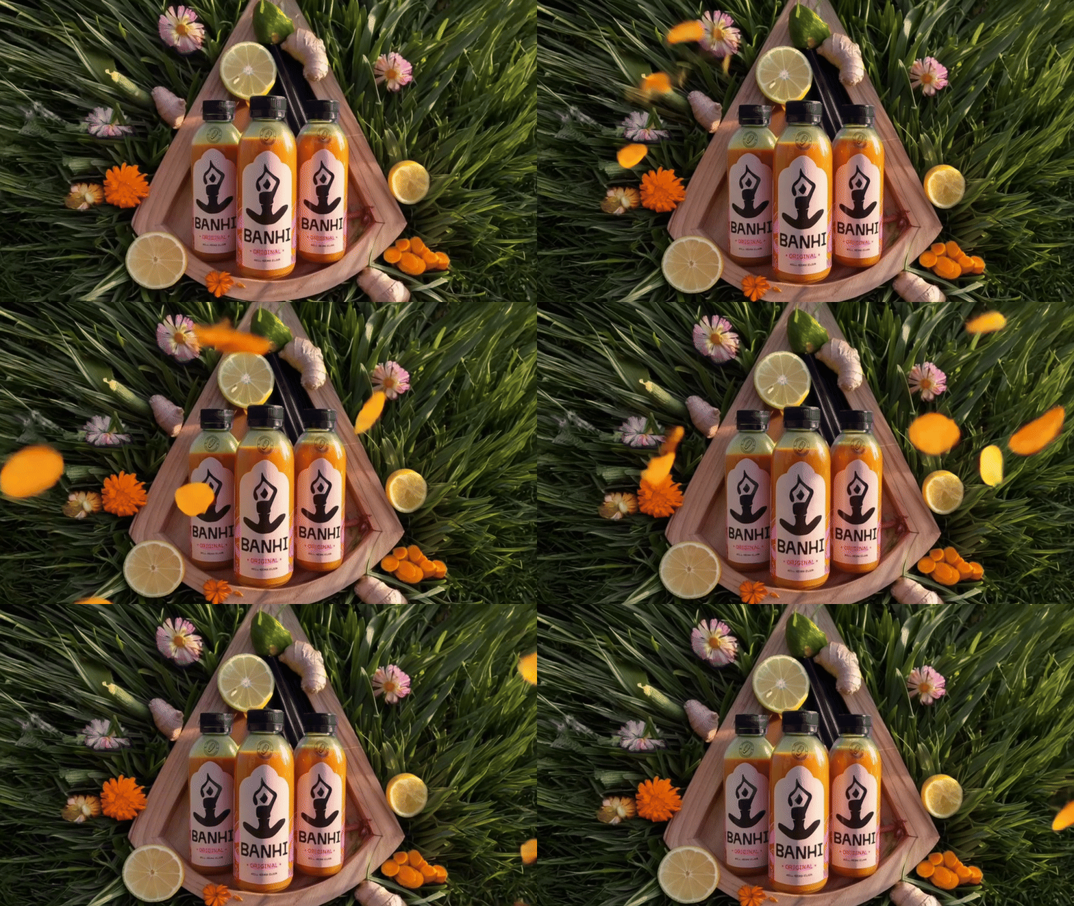
Banhi’s packaging was designed to feel like part of a mindful morning-not a supplement shelf. Clean, clear, and tactile, it communicates warmth, ease, and purpose at first glance. The bottle becomes part of her space-practical, elegant, and deeply intentional.
The emblem: a stamp of quality
As a brand built around one hero ingredient, Banhi needed to own turmeric-visually and symbolically. We created a dedicated emblem used on every bottle as a seal of purity: a mark of 100% turmeric power and the uncompromised quality behind it. It signals trust, intention, and Banhi’s confidence in its core ingredient.


Results and success
✅ Positioned to lead with purpose: Banhi was built from day one around a single hero ingredient-turmeric-with clarity, focus, and a strong emotional core. It’s set up to stand apart in a wellness space.
✅ Designed to feel personal, not mass-market: Designed to feel soulful and intimate-Banhi stands apart from typical wellness drinks, especially in curated, feminine-led spaces
✅ Strong emotional connection: ooted in ritual and softness, Banhi’s design invites women to connect not just with the product, but with themselves - making it more than just a supplement.
✅ Ready for direct sales & partnerships: The clear design makes Banhi easy to share and sell in direct-to-consumer channels and partner settings, helping ambassadors and collaborators carry the story forward.
✅ Flexible, scalable identity: From packaging to digital use, the system is built to grow-supporting future launches, formats, and brand expressions with consistency and ease.


What Banhi Thinks About Working With Us